Lissa Anglin • Part of Me Blog

Art, décor, family and photography- it's all part of me!

DIY

watercolor poppies bible journaling tutorial

HOME + LIFESTYLE, DIY, CRAFTSlissa-anglinComment
poppypagetitle.jpg

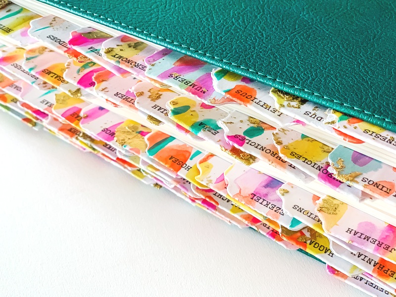
Hey friends! Since I’ve received my new Illustrating Bible, I have had the best time working in it! It has much larger space to create and I looooove the spiral binding and square shape. I’ve also found that the pages themselves are a bit thicker than other journaling Bibles I’ve had, which is great because I love to use watercolor, and it tends to bleed through.

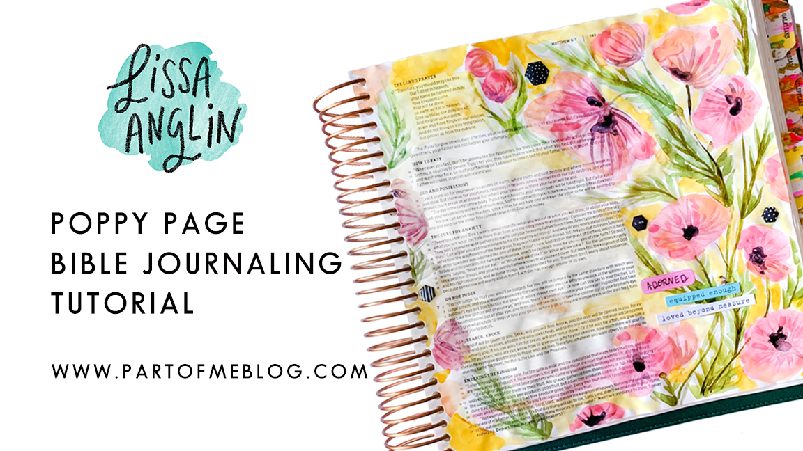
One of the first pages I created was this poppy scheme in Song of Songs 2 and I’ve had so many requests to do a tutorial on it I thought I’d give it a shot.

IMG_4524.JPG

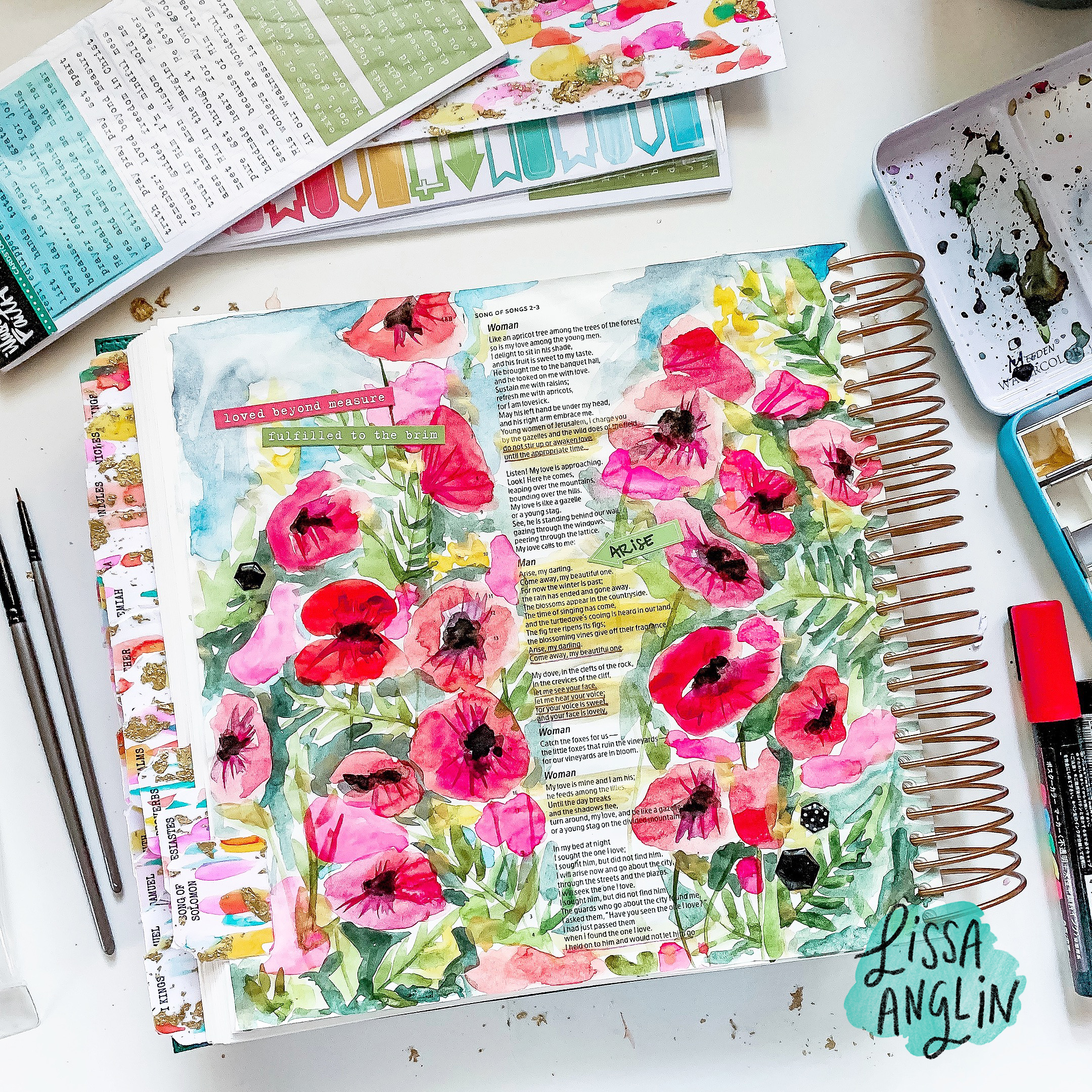
So, I set out to create a light pink version of this same concept, and I filmed the process so you can follow along!

poppypage.jpg

I have to apologize for the shaking camera and random interruptions- it’s summertime and my son was wanting to paint with me, so I wasn’t about to say no! I’ll post the links to everything I used at the end of this post.

Affiliate Links:

Illustrated Faith Bible Tabs: http://www.kqzyfj.com/click-9062253-1

Illustrating Bible: https://www.kqzyfj.com/click-9062253-13446143

Holbein Watercolors: https://amzn.to/2LoCCNx

Watercolor Tin: https://amzn.to/2DJJMWj

Round Brushes: https://amzn.to/2V0aqQH

Illustrated Faith Hexagon Stickers: https://amzn.to/2Ww7ssQ

DaySpring Blank Shape Stickers: https://amzn.to/2K6SSl0


So, let me know- did you enjoy this post? Was it helpful? What more would you like to see? Thanks for tuning in!

Customizing Bible Tabs with Watercolor and Gold Leaf

HOME + LIFESTYLE, CRAFTS, DIYlissa-anglinComment
IMG_4589.jpg
IMG_4603.jpg

I really hesitate to use the word “bling” in any circumstance…but honestly that is the best word I can think of to describe what this project is all about. :)

I got in my new Illustrating Bible from Dayspring and you guys, I’m OBSESSED. I want to paint in it all. the. time. I reviewed in on my InstaStories but if you haven’t seen it yet- it’s amazing. Spiral binding, huge margins for note-taking, painting, coloring- thicker pages which means I don’t need to prep them before I watercolor. It’s really amazing.

You can pre-order the new Illustrating Bible here- it will ship out May 15!

One of the first things I knew I wanted to do was make some tabs for it. I loved using the tabs on my last journaling Bible and knew it would make my Bible so much more “me”. So, I was really excited when I saw that Dayspring also had these Bible tabs that would be perfect for customizing. I ordered them and a few other Illustrated Faith accessories.

I love working in watercolor and on a whim I decided to throw in some gold leaf just to make it extra special. I have to say I am really pleased with the outcome and love that there is a burst of color from every angle of my Bible now!

I videoed the whole process, and if you’d like to make some of your own, this will show you exactly how to do it!

MATERIALS NEEDED:

Illustrated Faith Bible Tabs

Illustrating Bible

Holbein Watercolors

Watercolor Tin

Round Brushes

Gold Foil

Mod Podge

I would love to see what you create! Connect with me on Instagram @lissaanglin.

The Illustrating Bible was given to me by Dayspring to review and this post is my honest opinion. This post contains affiliate links that help me continue to bring fun content to this space, so if you like what you see, I’d love for you to use my links!

How We Connected With Our Adopted Daughter We Had Yet To Meet

Adoption, CRAFTS, DIYlissa-anglinComment
PinholePress-5975.jpg

“Congratulations, you have a daughter in China!”

I cried hearing those precious words from our adoption agency worker. 

I will never forget the cocktail of emotions I felt after that phone call. Shock that all of our paperwork actually went through and was approved by both the U.S. government and the People’s Republic of China. Elation that she was ours. Fear of all the unknown. Humbled and thankful to finally be at this part of the process. To be her mother

And then the overwhelm set in. Oh gosh, what now?! Besides the new stack of more paperwork, there was packing and planning to be done- we were actually going to get our daughter in China! 

Our agency told us that it would be around 3 months before we could leave to meet her and bring her home, as official paperwork needed to process and other preparations were to be made. My heart tinged with sadness as I realized that our daughter would be spending her second birthday in the orphanage. We wouldn’t be there for three more months. How was she to know that there was a family on the other side of the world, so excited to meet her and bring her home?

PinholePress-5999.jpg

All the time, I found myself thinking about what it might be like for the daughter we had yet to meet. Being told you have a family but having no concept of what a family is…watching your entire world transition but not fully understanding why. And then that inevitable day when two strangers come to hold you and speak to you in words you don’t understand. Gosh. It was going to get harder before it got better. 

I was so desperate to connect with our new daughter- to make this transition better in any way I could. Our agency suggested sending a care package to her, and I jumped at the chance. I knew that anything I might send such as blankets, toys, or clothing might be shared with other children in the orphanage (which was fine with me- the need is so great), but I knew one thing I must include in the package- a photo book.

PinholePress-5997.jpg
PinholePress-6022.jpg


Being a professional photographer, I have many resources to high quality printers and album companies, but for this photo book I needed something that was appropriate for tiny toddler fingers, not a bride and groom. So, I scoured the internet looking for something durable and kid-friendly. 

Pinhole Press’s board book was perfect. The size and rounded edges were ideal for her tiny toddler fingers. The pages were thick and glossy and would be protected from any nibbles or bottle spill. The pre-made templates on their website were so easy to customize with our names and photos. I included photos of each member of our family with our names on the corresponding page. The dogs even got their own pages, as did a few photos of our home. I wanted her to be familiar with as much as possible when she finally arrived home. 

PinholePress-6036.jpg

Once we received the book in the mail, I was so pleased with the result. The print quality was excellent and the colors were bright and beautiful. I mailed it to China a few days later. 

2018-02-14 15.56.43.jpg

Months later, we arrived in China to meet our girl. The day we received her was long and emotional, so I forgot that our daughter’s foster mother had given me a USB drive until about a week later. You can imagine my elation when I saw a photo of our sweet Lucy holding her book. 

Lucy with her book in China, March 2018

Lucy with her book in China, March 2018

Lucy almost 1 year later- February 2019

Lucy almost 1 year later- February 2019


I am so thankful I had this tool to connect with our daughter before ever meeting her. International adoption is a challenging but worthy process and little things like this make it so much personal and sweet. I love that our Lucy will get to keep this book as a part of her story, and I’m confident that before we ever spoke the same language, she knew me and I knew her.

DIY Scribble Floral Mural

HOME + LIFESTYLE, MOMLIFE, DIY, CRAFTSlissa-anglinComment

This is an idea I've had brewing in my head for well over a year now. It all started when my sister put in this gorgeous wallpaper in her daughter's nursery. THEN I started crushing on this Hygge & West wallpaper and just KNEW I had to put it in the girls' room (I'm actually really excited about the wallpaper resurgence- so many modern and colorful designs!).  

However, after doing all the calculations, I decided that it simply wasn’t in the budget. And, after seeing the oversized florals in Hayden's nursery I thought that might be a little more do-able. I also figured I could paint over it if I hated it! 

So, I decided to give the floral thing a shot. This method I used is really so forgiving- I will describe it in detail as best I can! And it was actually a quick project – the planning took a lot longer than the actual painting.

The first thing I did was sketch the composition on my iPad so I knew so I could get my ideas out "on paper", and play with color palettes. I pulled the composition off of a few bouquet photos I liked and traced certain parts of it to get me started. After that it was a matter of filling in the gaps, and repeating some of those same florals in different spots. I knew wanted to keep in the color scheme I have been prepping for their room anyway- pink, orange, mustard yellow, and black and white. I wanted the flowers to have more of an illustrative feel as opposed to a realistic look, which I knew would be a lot easier for me to achieve. I like to call these my "scribble flowers". 

Thanks to my iPad and Procreate, it's actually really easy to share that process with you here:

The room also has a chair rail on all the walls (when we moved in there was a really uh, interesting frog border sandwiched in-between the molding)-  and I wanted to make sure that everything would look right with the chair rail– so I knew I needed to do something to add interest there to keep the flow throughout the room. So, I also drew up a mock up of how it would look in the room. 

My room mock up with the floral design and border.

My room mock up with the floral design and border.

This woman actually swore she would never paint a room pink...famous last words!

This woman actually swore she would never paint a room pink...famous last words!


Once I had come up with a design I was happy with, it was time to paint!

My mom came over and helped me paint the three different colors on the walls – and this is definitely the hardest part! We ended up having to paint the ceiling after we realized it wasn’t actually white, but a very light blue which wouldn’t complement the new colors. I'm so thankful I had my mom to help me pick out the grey color (really more of a greige than grey) on the bottom- previously it was a really blue grey which made it feel cold and sterile to me. Since I knew we'd be adding warmer colors, it was really important to pick a grey with a warm undertone- otherwise it would have made the original grey look very blue.

IMG_8881.PNG

Pink background color: Valspar Arctic Ice 

White: Valspar Downy

Grey on bottom and in mural: Valspar Requisite Grey

We used Satin sheen with every paint- I have found it is very scrubbable without being too shiny.

If you watch my Insta stories (follow me @lissaanglin), you’ll remember that I recommended using an angled brush as opposed to a square one. I hate messing with painter's tape and have found that an angled brush gives me as good or better results. The key with the angled brushes to not overloaded with too much paint and go slow.

Once my base coats were ready, it was time to sketch out the composition. I’d like to do my outlines with chalk, since it wipes off easily. At first I tried drawing with white chalk, but it just wasn’t enough of a contrast on the pink, so I ended up using a light purple chalk. It did end up mixing with the paint somewhat, but it just wasn’t that big of a deal for me – so be warned if you choose to use a darker color of chalk – you might see it a bit!

Next I mixed all of my additional colors for the mural. To keep everything really consistent, I chose to use the same white paint that was on our trim and chair rail, so that all of the paint would have the same base color. Not all white paints are created equal – some have a blue base, some have a green base, some red, some yellow – you get the idea. I mixed the paint in my fancy Solo cups- adding about half a cup of white paint and then tinting the white with these paints from Michaels by adding just a bit at of color at a time and stirring well.

I am a messy painter!

I am a messy painter!

Keep in mind that your paint will dry darker than it looks when wet. It might be a good idea to paint yourself a test on a piece of paper and let it dry so that you can see the actual colors. I would also suggest using a more limited color palette – three or four colors max – it will keep it much more consistent and professional looking.

Once I had the composition sketched out and paints ready, it was time for the paint bottom layer which I'm calling the "blobs". This is a really fun part of the process. Using a square brush like these, I began to apply my blobs of paint using my outlines guides- but I wasn't too precious about it. ;)

 I wanted to make the color bleed outside of the outline in the end, so I purposely made the color blobs a bit larger than they needed to be. For simplicity sake, I decided to make all of the same types of flowers the same color – so peonies were pink, chrysanthemums were orange, etc. I attempted to do a time-lapse video of myself painting, but didn't quite make it to the outlining stage before my iPad died. However, hopefully this video will give a good idea of how I painted my blobs:


Once the blobs were finished, I let the paint dry fully and then it was time for the outline! I recommend using a round brush (these are great) for the outlines. Keep in mind you will likely need a smaller brush than you think, because when you put pressure on the brush, it’s going to get bigger. So, it’s better to lean on the smaller side so that your outlines don’t become too big.

Can't wait till there are two sweet girls playing in this room!

Can't wait till there are two sweet girls playing in this room!

Looking at my original sketch, I began to paint the outlines over my colored paint blobs. I didn’t worry too much about staying inside or outside of the lines – and purposely went outside the lines frequently. I used only 1 round brush for all of the outline, so that it was consistent throughout.

Once I was finished, I added some random colored dots/blobs of all the colors I used around the entire piece.

That’s it! I needed up having quite a bit of extra paint that I had mixed, and I didn’t want to throw it out because I’m a paint hoarder, so I went to the dollar store and bought some cheap plastic containers that worked perfectly for storage. Now if anything ever happens to the flowers (likely in our household), I have handy touch up paint.

After I was done I was hesitant to hang the curtains on top of the flowers, but that had been my intention from the beginning, and I love the way the flowers peek out from behind. Also, this room has a ways to go but let's be real- the toys are usua…

After I was done I was hesitant to hang the curtains on top of the flowers, but that had been my intention from the beginning, and I love the way the flowers peek out from behind. Also, this room has a ways to go but let's be real- the toys are usually on the floor anyway. :)

There you have it! If you made it through this far, thanks for reading and I hope you attempt some scribble florals yourself!