Lissa Anglin • Part of Me Blog

Art, décor, family and photography- it's all part of me!

HOME

#anglinabode master bathroom reno

AnglinAbode, HOMElissa-anglin2 Comments

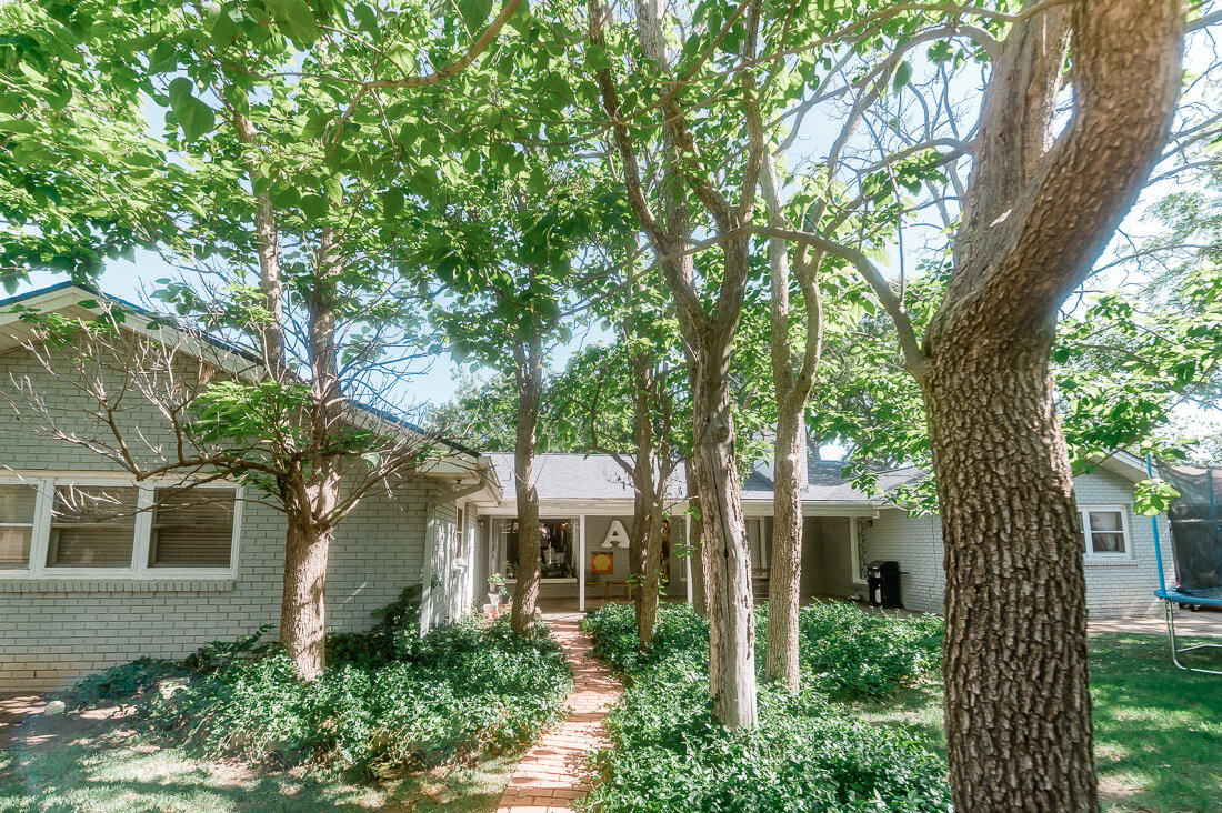
Goodness, it’s been a while since I’ve done a blog post, but this HAD to be documented! We’ve finally completed the master bathroom renovation for our Anglin Abode!

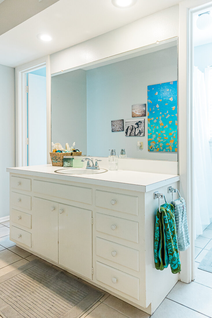
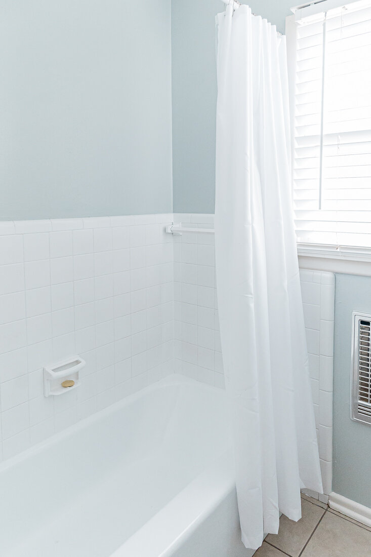
When we purchased this home, we knew we’d want to do a major renovation here, and so once the kitchen was done, we started saving for the master bathroom. I’d been calling it my “dorm bathroom”, because that’s what it felt like- barely functional with little to no storage.

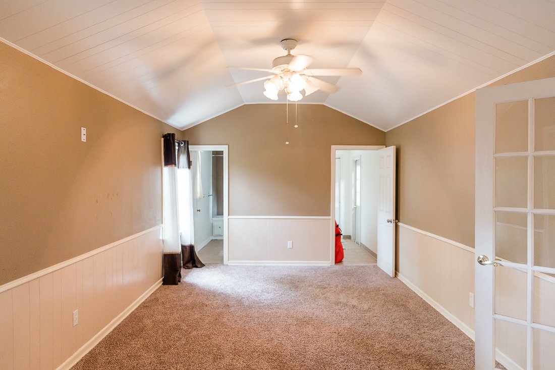
The bathroom is located at the very back of the house and was clearly a DIY add-on. It was essentially a square space that had been divided into two halves- one side being the bathroom and one being the laundry room. You can see the two doors in this old house photo below- the left is the bathroom and the right is the old laundry.

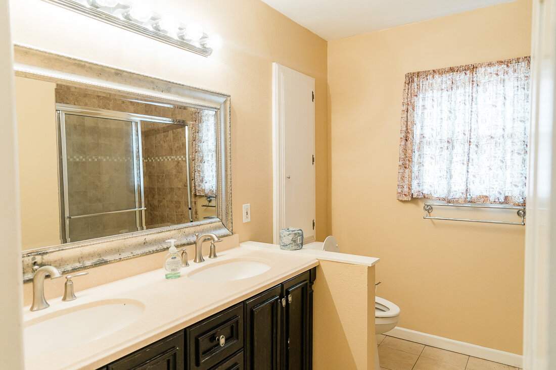
Here’s the left side- our “dorm bathroom” with basically no storage, and the toilet so close to the door I couldn’t even get it in this shot, haha!

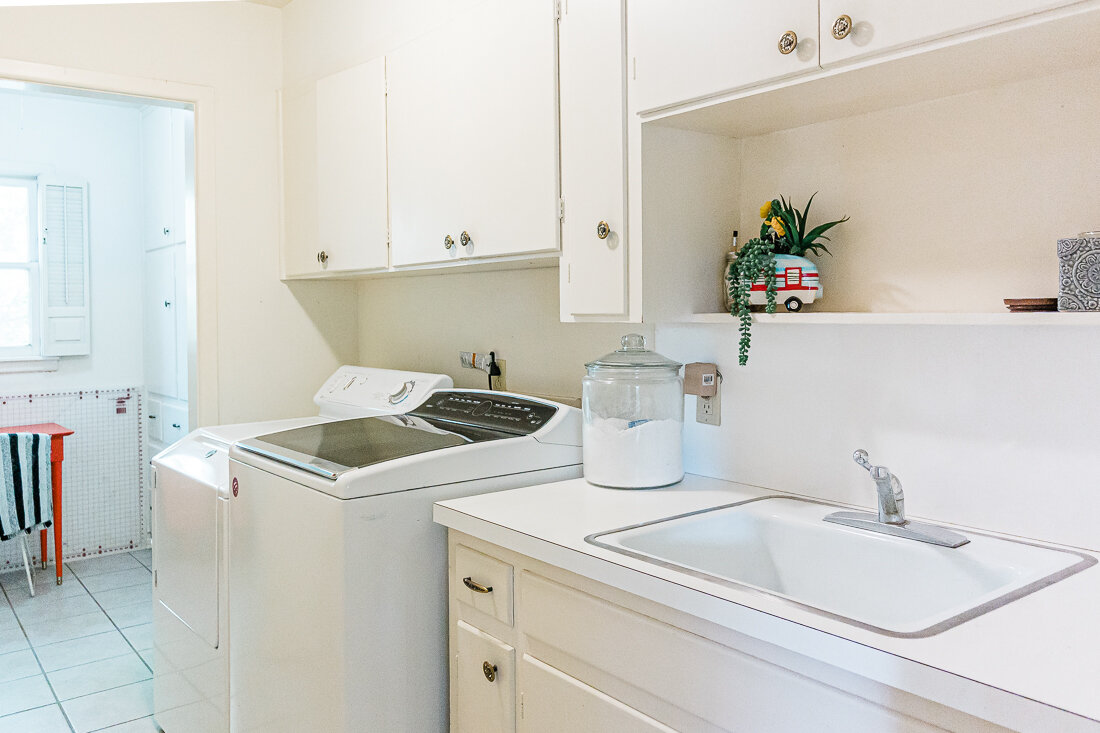
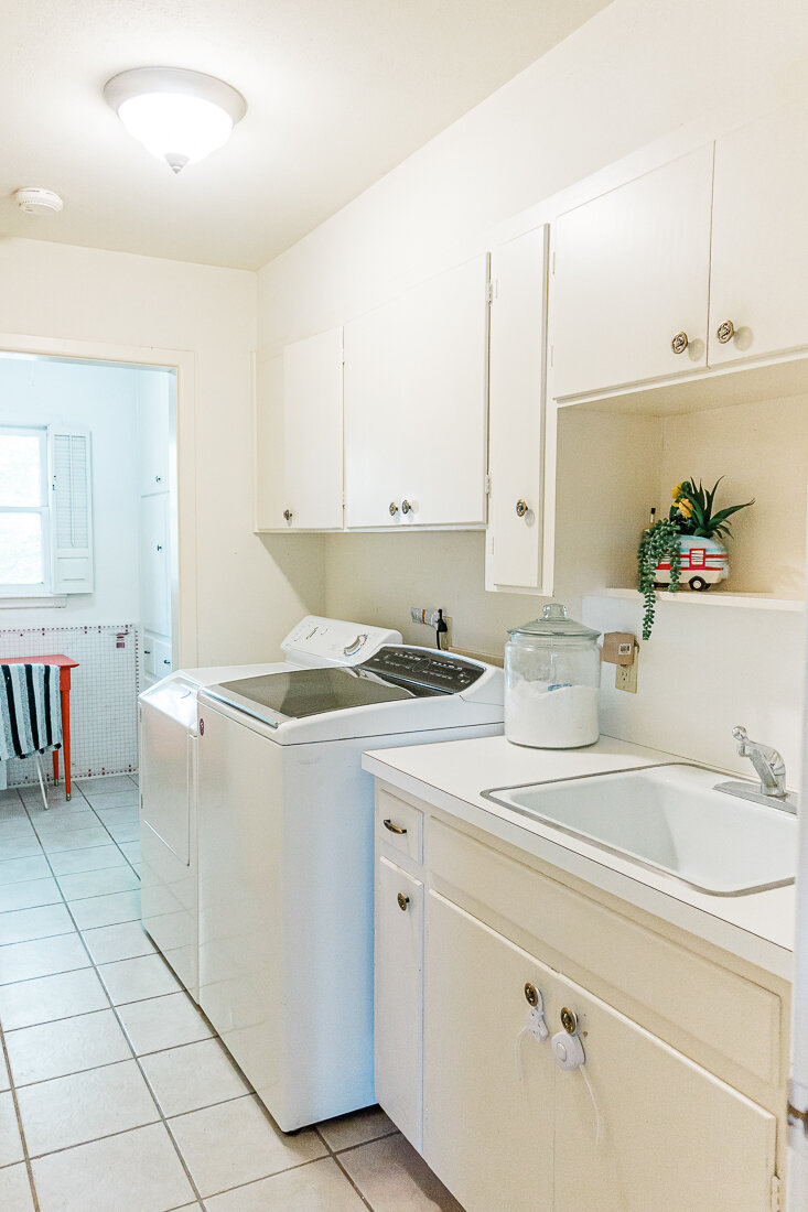
And the other side- old laundry room. There was a door to the exterior that we ultimately decided to close in.

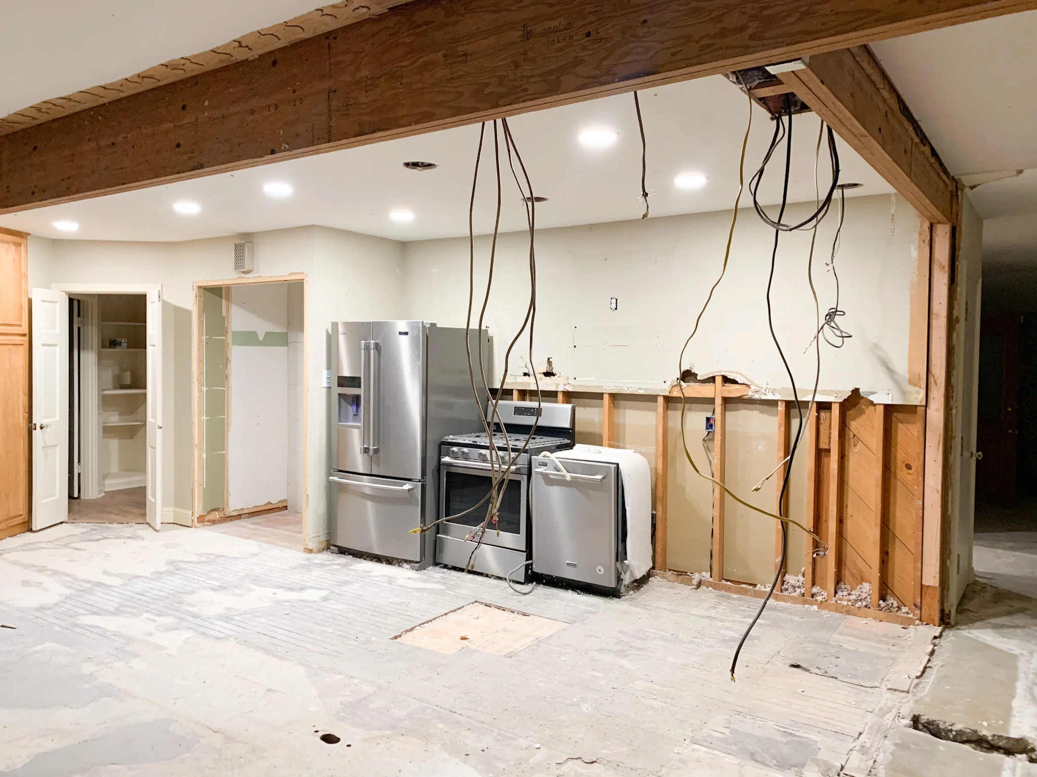
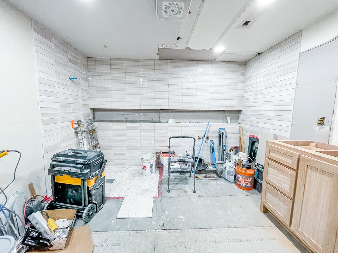
I COULD NOT WAIT to see what it looked like once that middle wall was removed. Here’s what it looked like! You can see the spot where the bathtub once was was in really bad shape, and we also had to contend with the water heater that was basically in the middle of the room.

Here is my sketch of the same wall.

In progress:

And the final!

East wall before:

My sketch:

And after!

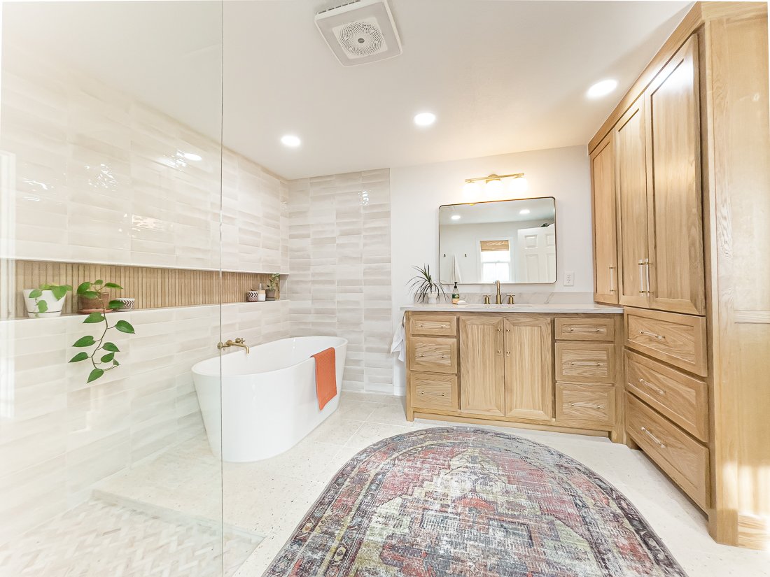
We are so in love with the way everything turned out. The square layout of the room was the biggest challenge for me, because I was set on having this semi-open shower and tub layout.

You can see below I was trying my darndest to squeeze in 2 vanities, but we eventually decided against this in order to create a more spacious feeling in the room. I also didn’t want to compromise any of that countertop (a.k.a. curling iron) space with 3 girls in the family. Thankfully, Shawn didn’t mind and so we share a sink.

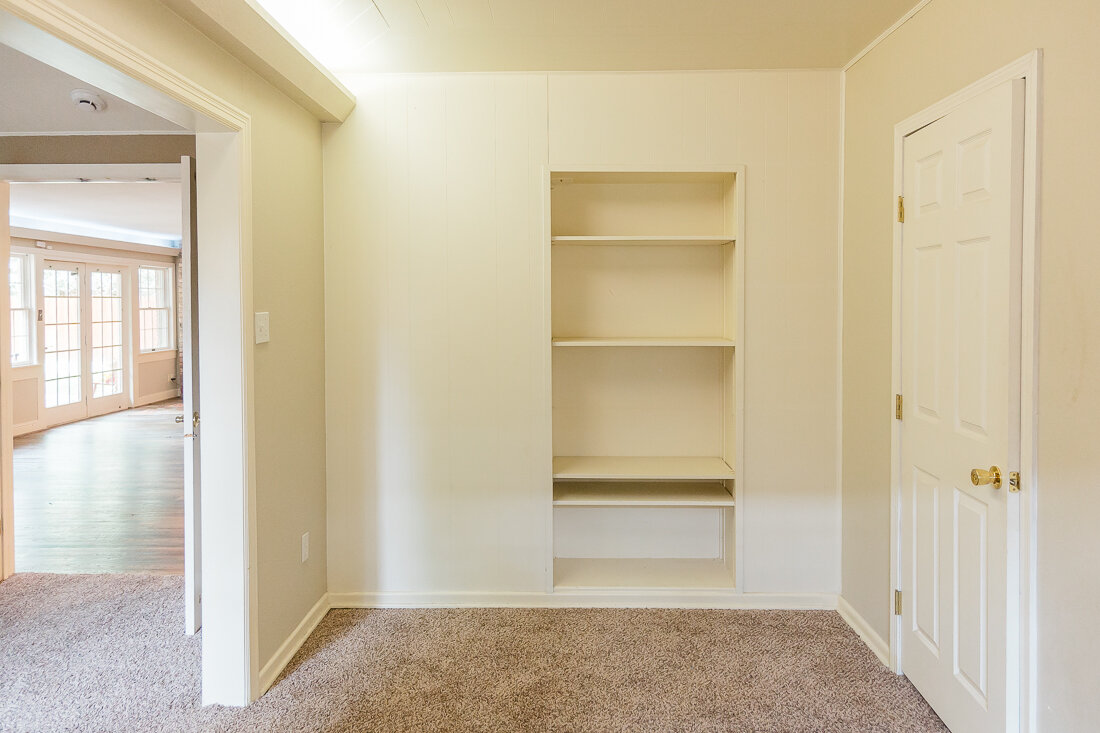
I also added in a floor-to-ceiling linen closet which was much-needed. This and the vanity gives us plenty of storage and keeps the rest of the room very open feeling.

My original design also included a curbless shower and a shower niche that extended all the way across the back wall, so that it is useful for both the shower and the tub, and adds interest to the completely tiled back wall. Our contractor eventually convinced me to add a small (it is maybe 1.5”) curb to the shower just to contain the water a bit better, and I am really happy with the way it turned out. This also meant I needed to add a 4th(!) type of tile to the design.

The large shower niche was also a bit of a challenge. Remember the huge water heater that was smack dab in the middle of this back wall? We ended up swapping it out for a tankless water heater that is located in a storage closet adjacent to this room and it was one of our more costly choices, but SO worth it. I love having hot water almost immediately when we turn on the faucet- and in this 76-year-old home that is something I don’t take for granted.

Instead of creating the shower niche inside the existing wall, our contractor essentially built a faux wall on top of the structural wall, and that allowed us to run plumbing for the bathtub and create this long niche. I love the way the horizontal line creates a steady, linear design, and place for my little plants!

Let’s talk about finishes!

I wanted our bathroom to be a very peaceful, spa-like space that would feel clean and cozy. I had tons of great inspo on my Master Bath Pinterest board, but unfortunately most of the finishes there were just way out of our budget. So, my goal was to create the same look on a budget.

I was crushing over this tile from Bedrosians, but it was just too expensive for us- so I ended up with this similar tile from Home Depot, which had the same warm white and color variation.

My biggest splurge and my favorite thing in our bathroom is the terrazzo tile floor from TileBar. I’m obsessed.

The wood-look tile in the niche is also from TileBar and was backordered for a couple of months, but it was worth the wait. It matches our white oak cabinets perfectly.

I also struggled to find the right size and type of rug that would fit this space, and was so excited when I found this WASHABLE rug! It is thin but absorbent. Because of the placement of our toilet, a rectangular shaped rug was too large- so the oval was a perfect solution.

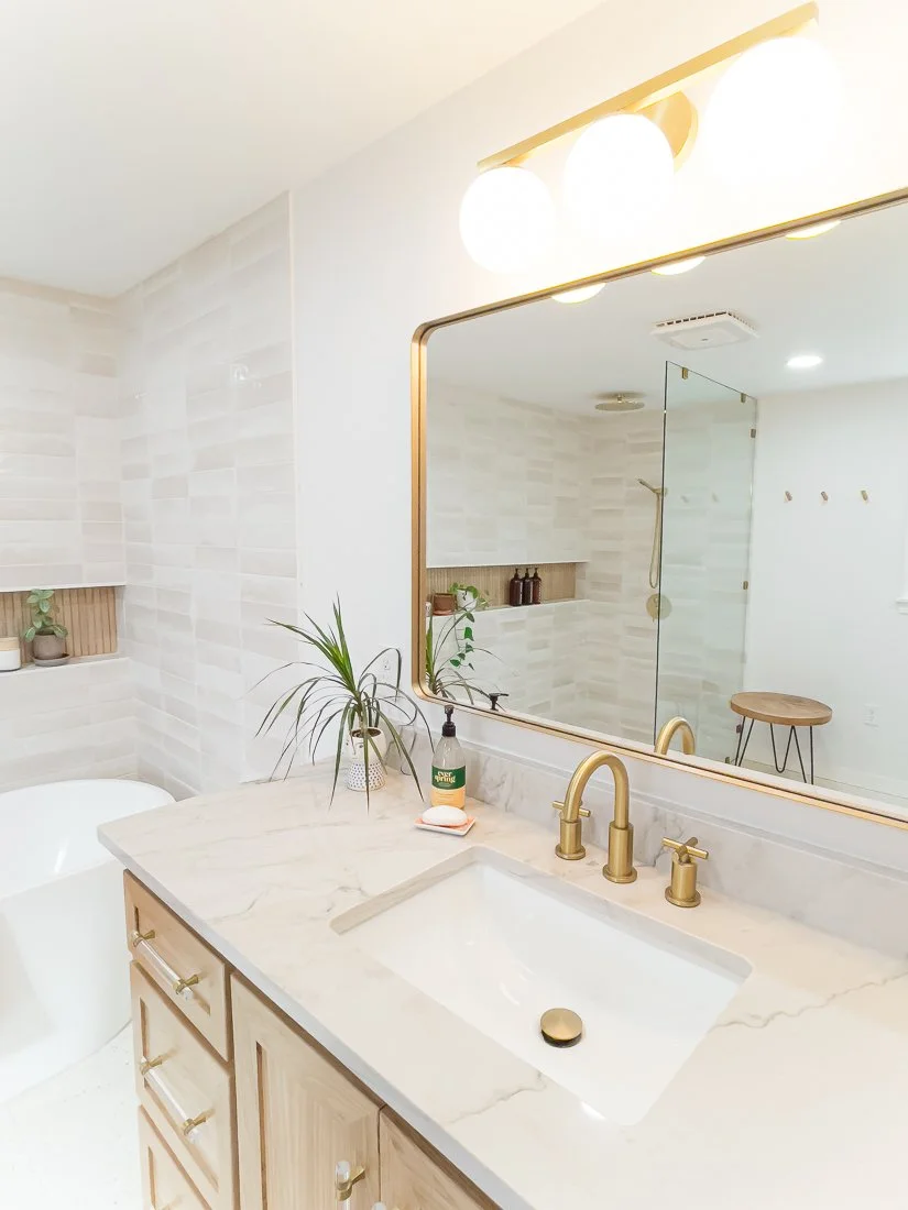
I did not initially plan on doing natural stained cabinets, but once I realized how light everything else would be in the room, I decided it would ground the space better to keep the cabinets natural. These are white oak with a clear coat finish. I loved the acrylic and gold handles I found, too- I like that they let the wood grain shine with just a touch of the gold that runs throughout our house.

The countertop is quartzite- similar to what we have in our kitchen. I love the soft grey and how it picks up the same tones in the wall tile.

All in all, we are super pleased with the space and it functions beautifully for our family. I love that I have a peaceful little spot and that it can essentially turn into a big steam room when the shower’s running.

I will link everything I can here!

Contractor: Allure Kitchen & Bath (they were so great to work with- we already have them started on another project!)

Wall & Trim Color: Pure White by Sherwin Williams

Floor Tile • Shower Floor TileShower Niche TileShower Wall TileVanity Light

CLICK HERE FOR ALL OTHER FIXTURES + ACCESSORIES

thrifted word banners made with cricut!

CRAFTS, DIY, HOMElissa-anglinComment
IMG_1354.JPG

Ya’ll, never have I had such a rollercoaster of a project. When I first pitched to Cricut that I wanted to make some cool signs for my home with thrifted pieces, I couldn’t WAIT to get started. So of course, I waited riiiight up until the last day to make them and GUESS WHAT?!? The project failed miserably.

So I tried it a little differently. FAIL. And then I tried like 3 more times before I just threw up my hands and yelled ABANDON SHIP! 😂Thankfully, I have one of the best thrift shops in town close by and so I hopped in the car and sought out some new inspiration. And like always, the thrift store delivered.

I ended up picking up some old linen napkins (you know, like your grandmother puts out at Christmas and Easter?) and making something I’m really quite proud of- these super cute NO SEW word banners.

I made these using my Cricut Air 2, Cricut iron-on, and Cricut Easy Press. If you’re a newbie to using Cricut iron-on, this would be a super fun project to start with.

The vintage linen napkins I snagged cost me a total of $3 at the thrift store. Mine were 19” square cloth napkins, but almost any scrap fabric would work for this- think tablecloths, placemats, etc. I think a pattern would make some really neat banners as well!

IMG_1343.JPG

Supplies Needed:

  • Cricut Machine- I used my Air 2, but depending on the size of your banner a Cricut Joy would work!

  • Cricut Light Grip mat

  • Cricut Easy Press

  • Cricut Easy Press Pad

  • Cricut Iron-on- I used white for “Hello Spring”, Beige for the shadow and Gold Shimmer for the main on “Life the Life”, and Black for the shadow and white for the main on “Always Be Humble & Kind”

  • Cricut Weeding tool

  • Old Linen Napkins or other fabric

  • Hot Glue Gun

  • Scissors

  • 5/8” Dowel Rod (or whatever suits the size of your banner)

  • Fabric De-fuzzer (obviously this is optional- but the napkins I bought needed it, and the iron-on wouldn’t have adhered well without a de-fuzz)

Check out this video for the full tutorial!

You can access my design files for FREE in the Cricut design space!

Always Be Humble & Kind Banner File

For this design, I used white Cricut Iron-On for the shadow and black for the main text. Click on the image to be taken to the file in design space!

IMG_1365.jpg

Hello Spring Banner

For this design, I used white Cricut Iron-On for the text. Click on the image to be taken to the file in design space!

Live The Life You’ve Imagined Banner

For this design, I used beige Cricut Iron-On for the shadow, and shimmer gold for the main letters. Click on the image to be taken to the file in design space!

I would LOVE to see your banners if you give this project a try- please tag me @lissaanglin! It was a relatively quick one, and so much fun to add the beads and twine. You could really go crazy with the extra decor- I’m thinking tassels, felt balls, buttons, flowers…you name it!

IMG_1346.JPG
CricutWordBanners4.png


More Posts Like This:

#anglinabode Kitchen Reveal

AnglinAbode, HOME, HOME + LIFESTYLElissa-anglinComment
AnglinAbodeKitchen-1323.jpg

I am SO excited to show you this before + after. This kitchen remodel was the top priority for us in this home- and the first project we tackled. I’d better show you what we were working with when we bought this home first.

The kitchen is behind this beige wall- you can see the fridge and top of the faucet from here. Unfortunately, the kitchen had already been renovated in recent years- but was just not my taste at all, and though there was an attempt to open up the space, it still felt very dark and closed in.

320822ndSt-8855.jpg
320822ndSt-8861.jpg

You can see here how the kitchen opened up into the back living space- but again, it just felt really dark and I felt it had the potential to function a lot better for our family with some reconfiguration. In the photo below, the far corner that has an air vent is where the coffee bar is now. Check out this post to see all the details on the coffee bar!

320822ndSt-8869.jpg

Here’s my sketch of the kitchen after demo. You can see that the beams had yet to be installed and the pantry (to the left) has been opened to make it larger- more on the pantry here!

In this sketch the kitchen island is flipped the wrong way so you can see the side that actually faces the oven. I hadn’t decided if I wanted to do a color on the island yet, or leave it white. Also, you can see I switched from knobs to pulls.

Untitled_Artwork 3.jpg

And now for the reveal!

I really love how it turned out. For this project, we had to put in two beams, since the parts of the kitchen I wanted to open up were structural. I was worried that it wouldn’t be able to happen, and it would have been such a disappointment had we not been able to open it up completely- BUT our contractors got it done!

Opening up the kitchen to the hallway and the back living space made it a much more functional space for our whole family and we spend most of our time in this area.

AnglinAbodeKitchen-1081.jpg

I love, love, love my green island. Once I knew we’d be doing saltillo tile throughout this space, I wanted to counter all those orangey-reds with something complimentary but still natural feeling. This color is Relentless Olive from Sherwin Williams, and I have never identified with a paint color name more in my life. :)

AnglinAbodeKitchen-1115.jpg

The white color throughout our home is Pure White from Sherwin Williams. I have been so thankful that I chose to paint trim, walls, ceilings, and baseboards all the same color- it has made the painting process so much easier for me and everything is cohesive.

AnglinAbodeKitchen-1139.jpg

Here is a before photo of the main hallway- to the left is where the laundry room door and cubbies are now, and to the right is the kitchen and island. You can see we lost a lot of great built-ins, but the functionality and flow we gained was worth it.

320822ndSt-8845.jpg

Here is my design sketch for the cubbies- I eventually decided to leave the bottom section open so I could fit whatever baskets I wanted. This doorway was also previously just a wall between shelving- we created a doorway here and moved the laundry room to this area.

Untitled_Artwork.jpg

I love that these cubbies have storage as well as hooks for backpacks, jackets, etc. Their location in the house is really nice too, because they are an easy spot to unload as you come inside- our front door is just opposite the shelf with greenery in the photo below.

AnglinAbodeKitchen-1167.jpg

A few notes on design choices here:

  • This home immediately gave me a spanish/mission feel and I felt like I could make that work seeing that we are in West Texas- and so I wanted to keep the textures and tones warm and cozy without it feeling too cramped.

  • My mid-century loving heart also needed some gold hardware and white walls- plus some Atomic Ranch vibes. So, the globe-shaped pendants and sconces over the island and coffee bar- plus the chandelier over the coffee bar that includes globes really satisfied that for me.

  • I really debated on the backsplash tile- and initially thought I would just go with white subway- but when I went to sample it, the white tones were just completely off- our paint choice being a warmer white made the subway tile look cold and hospital-like, so I kept looking. Finally- I found some interesting geometric tile on clearance at Lowe’s- and it was perfect. I would have never guessed I would go with it, but for us it has been subtle with some uniqueness- and because it is dimensional I have enjoyed the way the light plays off of it throughout the day. Unfortunately, because it was on clearance, we almost didn’t have enough to finish the job! We ran out of tile 3/4 of the way through and finally located a few more boxes in the Dallas area, where my sister picked them up and saved the day!

CoffeeBar-6026.jpg
AnglinAbodeKitchen-1351.jpg
  • One of the huge perks of this home (and one of the things that convinced Shawn it was s good buy) was that all the appliances were basically brand new- like still had the warranty stickers on them new. So, we didn’t have to spend anything on appliances, with the exception of the fridge drawers and ice machine in the coffee bar. This was a huge savings for us.

  • I chose a black sink in the main island and the coffee bar and I have loved that choice. Not only does it hide stains well, it is super durable and I love the contrast. I’ll link everything below!

  • Our countertop is Macaubus Quartzite- and is probably my favorite thing in our kitchen. I knew I wanted something that had a lot of veining and movement, but marble made me nervous and quartz didn’t have the natural feel I was looking for. So, when we visited the stone yard, our friend who owns the place educated us on the different types of stones and found this slab for us. It is overall a light grey with some subtle green, blue, orange and purple tones. The green of the island really picks up the veining, which I think looks like a heartbeat line in some places. I absolutely love it.

AnglinAbodeKitchen-1231.jpg
AnglinAbodeKitchen-1267.jpg
AnglinAbodeKitchen-1158.jpg

I hope you enjoyed my tour! I’ll list links to everything I can link below!

White Paint Color: Pure White by Sherwin Williams. Our trim, cabinets and walls are all this color and it has made painting the whole house (my primary job in this reno) SO much easier!

Tile: Saltillo (terracotta) tile from Yates

Countertop: Macaubaus Quartzite purchased from Stone King in Lubbock

Contractor: Re-Purpose Construction

Everything else linked below!

#anglinabode coffee bar before + after

HOME, HOME + LIFESTYLE, DIYlissa-anglin1 Comment
CoffeeBar-5814-Edit.jpg

So excited to finally share one of my favorite spots in our new home- the coffee bar! This space used to be a blank, open corner- and I knew immediately upon walking in the house that there needed to be something there to draw you in. Here’s the before:

320822ndSt-8871.jpg

Soooo much blah. There were several issues here we had to deal with:

  • The weirdo uplights that are along the walls above the doors and windows. We removed those ASAP.

  • The french doors (open in the above image) that led to the master bedroom. I have nothing against french doors, but I did not want them leading to my bedroom off the main living space- especially when my son has friends over (yikes!)- so we closed in this opening a bit and made it a regular door.

  • The thermostat had to be moved.

  • The AC vent was an issue- because I wanted to do lower cabinets there. I am pretty proud of our solution!

  • Sooooo much electrical work had to happen. Light switches and outlets needed to be moved, and I added sconces, under cabinet lights, pot lights and a chandelier. Because this room was originally a porch, there is NO attic space so installing all of this was a real task I’m thankful our contractors were up for.

320822ndSt-8845.jpg

The original view from the main hallway. Unfortunately, all of these shelves are now gone, but it’s for the better, I promise! You can see how this corner is visible at the end of the hall.

Here is my Coffee Bar Inspo:

Coffee Bar by Lissa Anglin

Here is the area mid-construction. This home has been renovated at least 2 times before this one- you could see all the layers and modifications once the walls were peeled back. Poor old house- I hope we will do her justice and make this the last renovation.

IMG_4651.JPG

Annnnnnnd here’s how it turned out!

CoffeeBar-5981.jpg
CoffeeBar-5989.jpg
CoffeeBar-6052.jpg

I’d originally thought about doing green cabinetry (Relentless Olive by Sherwin Williams, which is on our kitchen island), but chose to keep it white (Pure White by Sherwin Williams) so that this potentially dark corner stayed as light and bright as possible.

It was important to me to have a large decorative element (the open shelving) to draw you into the space from the front door. This corner is the perfect landing space for everyone, and it perfectly accommodates a solo cup of coffee or a bunch of rowdy kids!

One day, I’d love to find a tulip table to put in place of my vintage black one here, but for now this table is serving us well!

I mentioned the issue of re-routing the AC vent earlier, and the solution was to create a vent on the side of the bottom cabinets (see that gold box? It’s actually a vent!). We also created a new vent (also housed inside the lower cabinets) into our bedroom on the other side of this wall to keep the air flowing. Amazingly, we still have quite a bit of storage in those cabinets.

When I shared this corner on Instagram, many people thought this was actually my kitchen space- and it sort of is! It is open to the kitchen, so it feels like an extension of the kitchen, really.

This little corner packs quite a bit in to keep it super functional for our family. I didn’t want to have to walk all the way across the room just to throw away old coffee grinds or to fill up the pot. It includes:

  • pull out trash can

  • double drawer fridge

  • nugget ice maker

  • RO system

  • small sink

CoffeeBar-6058.jpg

This little area of our home is where I splurged the most. Having the extra drink space and “Sonic ice” has really made working from home enjoyable- and I also love the fact that everything is accessible for the kids.

CoffeeBar-6010.jpg

Another thing I was very intentional about was the black quartz sink. Knowing that there would be a LOT of coffee in this sink, I wanted to avoid having to bleach it often, and the black sink has been so wonderful for that!

Here’s a “lights on” image- we put the sconces, chandelier and pot lights on all different switches and have really enjoyed the ability to adjust the lighting to the time of day/mood. The bulbs inside the sconces are actually grow lights and I keep them on all day so that my planties get the sun they need.

CoffeeBar-5669-Edit.jpg

For the glass in the upper cabinet, I chose rain glass. I’m not into the frosted look, but I also wanted a little diffusion on it. I really love the way it turned out!

I’m going to do my best to link everything pictured here:

White Paint Color: Pure White by Sherwin Williams. Our trim, cabinets and walls are all this color and it has made painting the whole house (my primary job in this reno) SO much easier!

Tile: Saltillo (terracotta) tile from Yates

Countertop: Macaubaus Quartzite purchased from Stone King in Lubbock

Contractor: Re-Purpose Construction

Chandelier (I really wanted this one from West Elm, but it was just plain out of budget. In the end, I’m really happy with the one we have and think it is a more appropriate size for the space anyway).

Sconces (these were surprisingly affordable!)

Knobs

Sink

Faucet

Drawer Fridge

Ice Maker

Grow light bulbs (for keeping my plants alive! I put these in the sconces)

Backsplash tile was a clearance find and we almost didn’t have enough to finish the job because it was disappearing from stores so quickly! Thankful my sister picked some up for us in the DFW area so we wouldn’t have a half- finished wall.

Just in case any of you are coffee fanatics like us, here are our coffee makers:

Coffee Pot

Espresso Machine

Coffee Grinder

So, let me know what you think! We are loving our coffee corner and I have so much more to share with you soon!

This post contains affiliate links, on which I will receive a small commission should you purchase anything/sign up/subscribe etc. I would never share something I didn’t actually like or want to share with you, so I wanted to let you know. Sharing affiliate links affords me a few more lattes and it’s always my aim to add value to your life with the brands and products I share. Thanks for supporting me!

demo time!

AnglinAbode, HOMElissa-anglinComment

Demo on our house started just a couple of days after we closed, and if you read my previous blog post, you’ll know I was DYING TO SEE what laid beneath those two walls in the kitchen I wanted to take out.

If they were structural walls, it meant we’d need to add a big beam and pay all the dollars for it. If not, no beam and fewer dollars.

Well low and behold, we arrived shortly after closing to see this:

IMG_3262.jpg

It was, unfortunately, load-bearing. And the wall removal also revealed that there had been at least 2 other renovations on this poor home.

The built-in shelves which many people loved when I gave a tour on Insta were the first to go (sorry!).

Once we faced the music about having to put in a giant beam (and how much that would cost), demo continued.

IMG_3266.jpg

The front bedroom floors were ripped up to reveal plywood. This room will get new hardwoods.

IMG_4650.jpg

The ugly brown hallway tile was removed and so were the other shelves in the hallway that will eventually become the mudroom cubbies.

One day we pulled up and this was sitting in our driveway:

IMG_4117.jpg

Which only means one thing: beam time!

Here’s the before with all the walls/cabinetry removed:

IMG_4110.jpg
IMG_4111.jpg

And then in an afternoon, it was done!

IMG_4123.jpg
You can see here that they actually had to install 2 beams, as these 2 walls were originally exterior walls of the home.

You can see here that they actually had to install 2 beams, as these 2 walls were originally exterior walls of the home.

You can see that it really opened up the area!

You can see that it really opened up the area!

Below is the new laundry room- former sitting area off the master. The door in the back is our master closet. Master bedroom is to the right, and we sheetrocked over another door that went into the front bedroom closet, so I can build storage there later. The mudroom cubbies will be on either side of the door (currently open).

IMG_4475.jpg
Here is the door we closed up. There was really no reason for it to be there, and it will allow me some extra storage space on both sides.

Here is the door we closed up. There was really no reason for it to be there, and it will allow me some extra storage space on both sides.

Here is the new pantry with the old door I refinished for the entry into the pantry. I wanted something old/rustic as everything else will be new, and they are going to frame it out in the center of the pantry.

IMG_4477.jpg

A great surprise- they discovered original hardwoods in our master bedroom! We were super excited about this but they are an inch or two lower than the other floors that lead into that room, so I’m interested to see how that works out.

IMG_4470.jpg

This will be where the beverage bar is going. You can see they are working on the electrical here- they also had to add plumbing for the sink and ice maker. Another challenge is that I wanted base cabinets literally right over that huge AC vent. Thankfully, our cabinet maker is going to build it into the cabinets so we don’t have to relocate it and it can still be functional (and less of an eyesore).

IMG_4651.jpg

Hope you enjoyed seeing our bare naked home! Haha! Already walls are getting put back together so stay tuned for more updates soon!

initial design sketches for the Anglin Abode

AnglinAbode, HOME, HOME + LIFESTYLElissa-anglinComment

I’m excited to share my initial design sketches with you for the #anglinabode! These are the initial sketches I handed our contractor. I literally just drew them up over the listing photos and was like, “can you make this happen?!”. Haha, thankfully they have been great to work with and listened to all of my design concerns.

I mentioned in my first post about our new home that the first time we walked through it I was like


But then once I went home and had some time to really think about the layout, what I liked and hated about the house, a vision began to grow.

I started sketching and got really excited about the potential. Of course, everything was riding on the idea that we could renovate. Once I had a vision for the property, I couldn’t picture it working out for our family without the changes- and without the changes, I wasn’t interested in buying the home. So the reno was key. It had to happen.


Prepare yourselves, I’m feeling very GIFy today.

After talking it over with Shawn, we decided we’d want to re-do the kitchen and main living space, create a new laundry room, and re-do all the bathrooms. So yeah, pretty much the whole house- not to mention some exterior changes we’d like to make.

We decided to start with the kitchen, main living, and flooring and MOVE IN WITH MY PARENTS until those were done. Ya’ll, my parents might be the most patient and gracious people I know. We’ve been living with them for about a month now and I know they have earned some extra crowns in Heaven these past few weeks. :)


Let’s walk through some of the pain points and potential solutions:


LissaAnglin_PartofMeBlog_0077.jpg

Problem: SO MANY different types of flooring. There were original hardwoods in some of the rooms, carpet in others, and laminate flooring. Having so many different flooring types is a pet peeve of mine- and I don’t like carpet, either. In our last home, we ripped up all the carpet and installed laminate which made a huge difference.

Solution: Tile and refinishing the original hardwood, putting in new hardwood. Since I’m not a fan of carpet (rugs allll the way for me! Washable, replaceable, and hard flooring lasts way longer), I decided to do tile in the main entry hallway and kitchen/main living area, along with the new laundry room. 2 of the 4 bedrooms did not have the original hardwoods that the others did, so we planned to install matching hardwoods there. Flooring consistency achieved.

320822ndSt-8861.jpg

Problem: Kitchen was too closed off. The kitchen in this home had undergone a renovation not too many years ago, but it just wasn’t our style, and I didn’t feel it would function very well for us the way it was. Originally it must have been a closed in room, but had been opened up a bit to create a u-shaped layout with a bar. It wasn’t bad, but I really wanted to see it with a standalone island. So, I drew up this sketch:

IMG_0516.JPG
IMG_0517.JPG

Solution: Knock those walls down and create a 1-wall kitchen with an island. Here, we are getting rid of the wall that connects to the main hallway, and converting the current bar area into an island. This part of my plan was the thing I was most nervous about- we wouldn’t know whether this wall was load-bearing (which it likely was) until after we purchased the home. If it was, a beam would have to be put in and could be a large budget item.

I was pretty adamant on making the walls disappear so that the overall space would be a lot more functional and inviting for us, as we’d have more seating around a bar and the flow of the kitchen would work better. As it was, there was only room for 2 people, and 1 way in and out of the space.

Here’s a more updated sketch of the kitchen- in this sketch the island is flipped around so you can see the appliances- the side that is showing will actually be facing the kitchen wall. I’ve already changed my mind on a couple of things, so there will be tweaks.

IMG_0519.JPG
You can see the pantry here to the left of the fridge.

You can see the pantry here to the left of the fridge.

Problem: TINY pantry. Yall, this pantry space was wide, but only about 6 inches deep. It was laughable. There was NO way our family of 5 could contain all our snacks in there.

You can see the pantry already opened up to the closet behind it in this image.

You can see the pantry already opened up to the closet behind it in this image.

Solution: Open up the pantry to include the closet from the front room. The pantry solution was wonderfully easy- there was a closet right behind it that opened into the front living room. We decided to close it up and use that space to make the pantry larger. Yay!

The laundry room is located through the right door in this photo.

The laundry room is located through the right door in this photo.

Current laundry situation. That’s our Christmas tree, not a body bag, haha.

Current laundry situation. That’s our Christmas tree, not a body bag, haha.

Problem: Laundry area was inefficient. Ya’ll, I don’t love laundry, but I especially don’t love laundry if I feel like I am in exile while doing it. The placement of the laundry room had been moved a couple of times, it seemed, as this home has been added onto (we can count at least 3 renovations this poor home has already endured!), and currently, the laundry room was off the master bedroom. It had an exterior door- why? Who knows. No storage. Behind that door is the water heater. And to get to it, you have to go through the master bedroom. Plus, it took up space. If we moved it, we could DOUBLE the size of our master bathroom. Yes, please!

Current sitting area off the master- future laundry room!

Current sitting area off the master- future laundry room!

The other side of the new laundry room. This bookshelf will be made into a doorway that opens to the main hallway, so now you don’t have to go through the master to get there.

The other side of the new laundry room. This bookshelf will be made into a doorway that opens to the main hallway, so now you don’t have to go through the master to get there.

Solution: Move the laundry room. Am I crazy? Yes. Right off of the master bedroom, there was a little sitting area. Initially I imagined using it as space for a vanity or comfy chair- but then I realized it would be a perfect laundry room. If we were able to open it up to the hallway, it would be easily accessible but wouldn’t require a trip through my bedroom. And, it would be more centralized in the home. Plus, I’d be able to add storage and a sink. Having a sink in my laundry room is something I have always looked for- since I do so much painting and other creative projects, I like having a sink to wash out brushes, etc. that isn’t the same sink I do dishes in. A caveat to this is that our master closet is connected to this room, but not our master bedroom, so we’d have to also have a door to our master bedroom. I am excited about this, however, because I think it will actually make doing laundry easier since our closet is right off the laundry!

This area of our house which I am calling the main living area is actually an old patio that was enclosed. Because of that, there is no attic space here nor overhead lighting.

This area of our house which I am calling the main living area is actually an old patio that was enclosed. Because of that, there is no attic space here nor overhead lighting.

The old owners installed these very interesting light fixtures (you can see them over the windows and the door) that I couldn’t wait to see go. I also felt this back corner really needed something to define the space.

The old owners installed these very interesting light fixtures (you can see them over the windows and the door) that I couldn’t wait to see go. I also felt this back corner really needed something to define the space.

Problem: Lots of space with no function. I love a well-designed home, and if you don’t know by now, I care A LOT about the function of the home, as well as the visual style. So, in envisioning our main living area, I saw a lot of space without a lot of function. It was missing overhead lighting, and I wasn’t sure what the furniture configuration would look like.

IMG_0520.JPG

Solution: Add cabinets to create storage and define the space. Because we were losing some cabinet space when we opened up the kitchen, I thought it would be fun to add some cabinetry to the back corner of this main room. You see this corner upon entering the home, and it would help designate a dining space for the room. So our “beverage bar” was born! My sketch here includes L-shaped cabinets, open shelving, outlets for coffee makers, etc. and a small sink. We also got a little bougie and included a nugget ice maker and refrigerator drawers for sodas, beer, etc. I am really excited about this little area and hope it becomes an easy entertaining space for us and our kids. I plan to put our dining table in this corner.

320822ndSt-8845.jpg

Problem: No mudroom/inefficient shelving. When we first toured the home, I loved the built in shelving that was at the end of the main hallway. However, I didn’t love it as much as I loved the concept of a more open kitchen. In order to open up the kitchen we had to lose the shelves on the right side. The other side of shelving had one bookcase-style shelf, and one magazine-rack style shelf. I am sure I could have come up with a creative solution for those magazine racks- but I really wanted them to be more useful.

IMG_0521.JPG

Solution: Make them into storage/Mudroom type shelves! I designed 2 symmetrical areas on either side of the new laundry room door. They will have an enclosed cabinet up top, hooks in the middle, and cubbies for shoes in the bottom. So excited to see these come together!

320822ndSt-8875.jpg

Problem: Ugly fireplace area. I loved the storage, shelving, and fireplace here, just not really anything else. The fireplace insert is not one I would have chosen, nor is the mantle or cabinetry style. So, this area is going to get some cosmetic touch ups.

IMG_0515.JPG

Solution: Lengthen the mantle and reconfigure the shelves. I love a good mid-century mantle, so I have a 10’ one planned for this space. I am hoping to adjust the middle shelving unit so that I can put a TV over the middle and still get to decorate over the fireplace.

There are lots of other little changes happening within these BIG changes, so I’m hoping to do some close-ups on them as they get completed. Tell me- what do you think of my plans? Which solution is your favorite? I can’t wait to see this home look cohesive, beautiful, and functional.


I’ll take the mid-century goodness without the housewifey-ness, please!

BEFORE tour of the #AnglinAbode

AnglinAbode, HOMElissa-anglin1 Comment
320822ndSt-8802.jpg

I sure hope you, my lovely blog readers, are prepared for LOTS of house posts from here on out! Truthfully, I love a good before and after and really want to document the renovation process well- and this little space is the best place to do it!

This is our 3rd home to purchase, and though it happened pretty quickly, we had been pondering it for a while. I have always been an old-home lover, and preferred fixing up an existing home rather than building a new one. There is something really special about the unique nooks and crannies, creaky old floors, and history of an old home to me. So for several years, Shawn and I have been talking about buying an older home to buy and make ours- keeping consideration for the original features and personality of the home while adding in some modern conveniences.

We absolutely loved our old home (photos in my last post), but we’d reached the point where we were hesitant to make any more improvements to the home, lest we over-invest in the property and not be able to get our money back when we sold. So, we had our eyes on a few different neighborhoods in our city- ones where we believed we would be able to invest a good chunk of change into a home and still see a return.

Thankfully, one of our best friends is a realtor (and a killer one at that! If you need one in the Lubbock area- Jim Archer is your guy!), and was very patient with us as we would randomly text him Zillow listings, asking for his thoughts on a property- yes, we were THOSE people, haha. After a while, Shawn and I decided we needed to quit our Zillow hobby and just be content.

Sure enough, one Saturday a couple of months ago, Jim called us and said he had found a house that might work for us. We’d already seen the listing, and weren’t super excited about it, but we went to see it anyway because it is in one of our favorite neighborhoods. Seeing it in person didn’t help our attitudes about it. It was sort of hodge-podge, as many homes in this neighborhood are, and had been renovated maybe 2 or 3 times already- none of which was in our taste.

So, we pulled out of the driveway with kind of a “bye, Felicia!” attitude, and then turned the corner to see the perfect view of one of our favorite parks- literally a block away. And then the more I thought about it, the more I was able to have a vision for what we would do to make it ours- to pull it together to feel cohesive and cozy.

The location is one of the biggest perks- as well as the fact that we are getting an additional living space, another bathroom, and 4th bedroom. The square footage is still about the same as our old home, but the backyard is nice and large with big trees.

But I knew I’d want to do some big-time renovations. Like, an entirely new kitchen type big. And completely redoing all the bathrooms, plus at least one other project in each room. So the numbers had to work. Shawn and I had already decided that the proceeds from our 2nd home needed to cover all the down payment/purchasing expenses of our new home PLUS the entire renovation budget, which is a lot to ask. We ran lots of numbers and several different scenarios. Jim was super helpful with this and it was really nice to have an outside opinion that understood our overall goals in purchasing this home.

We put in an offer. They countered. We countered again, and they accepted. And suddenly, we were buying a home!

Our main goals for this house are:

  1. Make a great investment. Don’t over-invest in the property- be smart with our renovations and improve it so that we are able to sell it (if we want to) for a profit.

  2. Make a great home for our family. So much of this purchase was about the neighborhood. We are SO excited to be close to 2 parks and a coffee shop, plus a lot of other families with kids the same age.

  3. Create a welcoming space for others. We believe that this never would have worked out had God not gone before us in it- and want our home to be a place where people feel God’s presence.

  4. Create functional workspaces for both Shawn and I. Since we both office from home, this is also a priority and boy have we realized that during quarantine! Ha!

We chose to go ahead and start with the kitchen and flooring renovations first, move in with my parents for a few months, and put all of our stuff in a storage unit. We had been warned that living through a kitchen reno isn’t for the faint of heart- and because we had the option of staying with my parents, we took that opportunity quickly! So thankful they are willing to put up with 5 more people in their home.

So without further adieu, here are the “before” photos of our new home!

I wasn’t able to get a straight-on view the day I took photos, because there was already a dump trailer in the driveway- ha! I love the wide porch, circle drive, and large pew that the previous owners left on the front porch. In this photo I’d alrea…

I wasn’t able to get a straight-on view the day I took photos, because there was already a dump trailer in the driveway- ha! I love the wide porch, circle drive, and large pew that the previous owners left on the front porch. In this photo I’d already moved all my plants over.

Front entryway.

Front entryway.

Front entry hallway. This is actually a very wide hallway that I really want to make great use of.

Front entry hallway. This is actually a very wide hallway that I really want to make great use of.

Front bedroom. I am thinking this will be the guest bed/my office. I love the light in here!

Front bedroom. I am thinking this will be the guest bed/my office. I love the light in here!

Front living area. We are hoping to put Shawn’s desk and a small living/tv space in here.

Front living area. We are hoping to put Shawn’s desk and a small living/tv space in here.

The front entry hallway ends in this room which is the back living space. It was originally the back porch of the house.

The front entry hallway ends in this room which is the back living space. It was originally the back porch of the house.

The room is open to the kitchen.

The room is open to the kitchen.

Another view of the kitchen. The door on the right is the master bedroom.

Another view of the kitchen. The door on the right is the master bedroom.

Looking into the kitchen/back living space from the east hallway.

Looking into the kitchen/back living space from the east hallway.

This is an odd little sitting area off the master bedroom. To the left of this window is the master closet.

This is an odd little sitting area off the master bedroom. To the left of this window is the master closet.

Opposite view of the sitting area. The door on the right opens to the front bedroom closet which is a bit odd.

Opposite view of the sitting area. The door on the right opens to the front bedroom closet which is a bit odd.

Master bedroom

Master bedroom

Master bath- this is through the left door in the above photo.

Master bath- this is through the left door in the above photo.

Laundry room- this is through the right door in the master bedroom photo. We moved over our deep freezer and Christmas tree- that is not a body bag! Haha

Laundry room- this is through the right door in the master bedroom photo. We moved over our deep freezer and Christmas tree- that is not a body bag! Haha

East side hallway- connects the kitchen to the kids’ bedrooms and guest bathroom.

East side hallway- connects the kitchen to the kids’ bedrooms and guest bathroom.

Back bedroom

Back bedroom

Small ensuite bathroom in the back bedroom.

Small ensuite bathroom in the back bedroom.

Hall/Guest bathroom

Hall/Guest bathroom

Front bedroom

Front bedroom

And backyard! We moved all of our “outside stuff” over, so it is a bit of a mess right now.

And backyard! We moved all of our “outside stuff” over, so it is a bit of a mess right now.

Planning on lots of sweet memories here!

Planning on lots of sweet memories here!

There you go! Next up I’m going to show you the work that has already been done- our contractor did NOT mess around getting started!

Tell me what you think! What do you like best? What would you get rid of first? If you want a sneak peek of what I am envisioning, come follow me on Pinterest!

This has already been such a fun project. Thanks for tuning in!

my best staging tips when selling your home

HOME, LIFESTYLElissa-anglin1 Comment
DSC_1104.jpg

If you’ve been following along on Instagram, you know we are moving houses! We have loved our current home for 6 years, and a lot has changed since we moved in- like adding 2 more people to our family and somehow accumulating a LOT more stuff.

We aren’t leaving Lubbock, just moving neighborhoods. Many weeks ago, our Realtor and friend, Jim Archer (who we highly recommend!) knew our desire to find an older home to fix up, and called us about a home he’d found in one of our favorite Lubbock neighborhoods. So, we went to see it, and hated it. But then- plot twist- we ended up buying it! I can’t wait to share more about that, but this post is dedicated to STAGING.

Once we knew we were buying the new house for sure, the scramble to stage our current home began.

Here’s what we did to prep our home to be put on the market:

We ended up taking down the map and frames here so that the brick was the focus of our entryway.

We ended up taking down the map and frames here so that the brick was the focus of our entryway.

1. We MAJORLY de-cluttered. I went through every junk drawer, closet, craft room, etc. Marie Kondo style. I kept a trash bag and a box for garage sale items nearby, and tried to conquer one or two spaces a day. Garage sale items went into the garage, and trash went to the bin.

Much of what we removed were kids’ toys. I knew we’d never be able to keep our house clean with lots of toys available to our kids (haha), so we put pretty much everything (including the girls’ large dollhouse) in a storage unit.

We also removed quite a few pieces of furniture in order to open up our main living area and make it more walkable for people viewing it during a showing. Furniture also went into storage.

Another area we almost forgot about was the backyard. All the kid stuff (except the trampoline) was removed. I swear, we found about 47 Barbie shoes hidden in the plants. 😂

You can see the trees in our master bathroom in this old photo. I pondered removing the mirrors as well, but ended up leaving them for staging.

You can see the trees in our master bathroom in this old photo. I pondered removing the mirrors as well, but ended up leaving them for staging.

2. We took down/painted over super-specific design choices. This was a little heartbreaking to me, as I had spent many hours designing Knox’s constellation bedroom. His room had a large, dark mural on one wall that just had to go- it was much too specific of a design to appeal to a large group of buyers, AND I didn’t want to deter anyone that wasn’t willing to take it down themselves. Thankfully, my mom came over and lovingly helped me scrape all day to get the wallpaper off- not a fun job for sure.

I also had a tree design painted in our master bathroom, which I loved, but wasn’t sure many others would. I chose a neutral grey and it made the space really calm and open feeling. We did leave the girls’ floral bedroom mural in hopes that whomever bought the home might have a little girl, or just like it and want to keep it.

My favorite 60’s toile chandelier has been in our home since I stole it from my parent’s house, haha.

My favorite 60’s toile chandelier has been in our home since I stole it from my parent’s house, haha.

3. We removed fixtures we wanted to keep. We replaced a few light fixtures (like my favorite tole chandelier) with simple neutral ones that would appeal to most buyers.

4. We removed quite a few personal family photos, and some weird decor items. I guess I have a thing for body part decor? I took all these items to storage as well. We debated on whether or not to leave our family photo gallery wall, and ended up leaving it, hoping that it would help buyers visualize what they could do with the space. If we’d had more time, I would have tried putting some neutral art in the frames in place of our family photos.

“Manny” the lamp was taken to storage. We love him but understand he’s a lot to take in 😂

“Manny” the lamp was taken to storage. We love him but understand he’s a lot to take in 😂

5. We made sure it smelled good. Before and during showings, we had our diffusers running with our favorite smell. It is such a delicious fragrance, leathery, musky, but fresh. Grab some for yourself here. (It’s not in stock at the time I’m publishing this post, but I watch it often and if you follow me on Insta, I’ll let you know when it’s back! Worth the wait for sure!)

Goodbye pups. We love you but some people just aren’t into animals. :)

Goodbye pups. We love you but some people just aren’t into animals. :)

6. We got rid of any signs of a pet. Dog food, bowls, crate, dog beds and most importantly- the dogs themselves- were gone. Thankfully we were able to bring them to my parent’s house during showings.

7. We did LOTS of touch-up/clean up work. Once everything was clean, we went through and touched up several areas with paint. We also went through the house with a magic eraser- it will clean gunk off of almost any surface! I paid particular attention to anything someone might need to touch, such as doorhandles, light switches, etc.- as these things can really impact the overall impression of the house.

FFDEAE40-19AB-48CD-A9CE-57664DD1E75D.JPG

8. We invested in some new front porch decor to make a really great first impression. A new wreath, doormat, and some plants to spruce things up really did the trick. You can check out my wreath and doormat here.

9. We hired someone to help clean. After decluttering and working on getting everything staged, we were exhausted and it was so refreshing to have someone do a deep clean of our home in order to prep for showings. Worth every penny, and we are going to have her back right before we close!

10. We let in the LIGHT. This is a lesson I’ve learned photographing homes for sale. Oftentimes curtains are pulled shut and the natural light a home offers is hidden. We kept all the curtains pulled open, and let in as much light as possible. More light = more space.


We had about a week to get the house ready- since we’d already set a date for an Open House. Towards the end of the process, Shawn and I went around yelling, “We can’t let them know we SIT!” (If you don’t get reference, watch this video). Honestly, I could have spent another week working on it, but I was really proud of our home once it was all ready- even a little sad that we were leaving it!

We also made sure we had great photos, and thankfully we had some practice in that area, haha. If you are selling your home, I can’t stress enough the importance of having light and bright photos of your home done by a professional. That combined with a stellar Realtor had our home sold in just 3 days on the market. You can check out the listing photos of our home below. I hope this list has been helpful!


Gallery Wall Update

HOME, HOME + LIFESTYLE, CRAFTS, DIYlissa-anglinComment

Lucy has been home for almost 2 YEARS now- and guess which professional photographer has ZERO framed prints of her newest daughter in her home?! Yep. This one. What’s the saying? The cobbler’s children have no shoes? It’s like that at our house, unfortunately.

Realizing the great need for her sweet face to adorn our walls, I was also feeling all cluttered and anxious about the current state of our living room/dining room gallery wall:

IMG_2017 2.JPG

Yes, that is the infamous man lamp. He’s been in the family for years, and he has now relocated to my desk.

Anyway, it was high time for a change. I wanted a simpler gallery wall look and imagined large frames with large white mats. So, my first step was calling up my friend Lauren for some new family photos. Lauren did her MAGIC (seriously, she is magic) in about 10 minutes and the kids were rewarded with giant chocolate bars. I love the photos from this session so much, I’ll have to share them in another post.


If you’d rather watch the video version of this post, feel free to scroll on down!


After measuring the wall and deciding how large I wanted my frames to be, I did a little mock up in Photoshop. I knew I wanted an oversized, floor-to-ceiling look, so I measured the wall and did the maximum size I could.

Wouldn’t that completely cover the wall again?! Yes, but the reason this works from a design standpoint is because the large mats and skinny frames don’t require a lot of visual space.

Tip: If you are wanting to recreate this look, it’s very important that you measure your wall space, and use skinny frames close together (mine were 2 inches apart) with large neutral colored mats.

GalleryWallMockUpweb.jpg

I originally thought I would do black and white, but that was vetoed by everyone else in the family, and also thought I could fit 8 frames in instead of 6…math was never my forte. It did help me plan and visualize, though!

After a LOT of shopping around, I ended up with these frames from Michael’s. They are technically poster frames, which makes them less expensive, and have plastic instead of glass.

When I first hung up the frames, I was a bit disappointed that you could see the slight bending of the plastic when the light glared on them (revealing that they aren’t truly glass)- this is a little thing that my perfectionist self wanted to fix immediately- but after thinking a bit, the plastic is really a better choice for our family right now- especially since these frames sit lower to the ground.

GalleryWall-5225.jpg

You can see the bending glare a bit in the above photos.

I ordered these prints from Sam’s Club, of all places! They were having a sale and though I typically recommend mpix.com, I thought it was cheap enough to give it a shot. In the end, I was pretty happy with the way they turned out. I was able to pick them up in 24 hours. They were delivered rolled up, so I flattened them out and put them under a weighted piece of artboard for a couple of days to make them easier to frame.

My frames are 24x36'“, and I ordered 16x20” prints. I thought I would just order custom mats for the frames, since that is an irregular mat size, but Michael’s was going to charge me $38.00 per frame! So, I was super excited when I found FrameItEasy.com. I was able to order exactly what I needed for around $10 per mat.

Click here to get 10% off your order at FrameitEasy.com!

(affiliate link)

The mats fit perfectly and were great quality. I also love that they do framing, and will probably be ordering all-out framed prints from them next time.

I used regular ‘ol masking tape to tape the prints to the back of the mats. I realize this is a no-no in the photography world, as it’s not archival quality and the chemicals in the tape will cause the prints to break down over time, yada, yada, yada….but let’s be real, I’m going to change these prints again before anything like that starts happening.

Once it was time to hang, I began with the center two prints and worked outward, using a level to make sure the lines were all straight. I’m not going to lie- these frames are a total pain to hang with the tiny sawtooth hanger (I MUCH prefer wire across the back), but you only have to do it once. :)

Tip: Even after I had then all hung, they still tilted a bit one way or the other, so I attached velcro command strips to the backs of the frames and onto the walls, which keeps them straight (and in place when a kid decides to ram into one- we have a rambunctious crew, ya’ll).

In the end, I was super pleased with how it turned out! The frames are semi-obstructed by the couch in our living room, but all visible from the dining/kitchen area.

GalleryWall-5268.jpg

Watch below for a few more details on the process. I hope this was helpful!

knox's constellation bedroom!

HOME, HOME + LIFESTYLElissa-anglin1 Comment

I’ve been promising Knox (our 8 year old son) that I would redo his room for over a year now and have finally, finally finished it. He has been so patient! This room was previously painted a mint green with a mashup of furniture and an overflow of toys. So, we took the opportunity to do an all-out cleanup and make some bolder design choices that would take him from little boy room and still be appropriate for a teenager.

Knox loves Star Wars and science, as well as maps and travel, so I thought this constellation design I created for a Minted wall mural challenge would work really well for his room. Knowing that it was mostly black/dark, I painted the other 3 walls of his room white. I was really impressed with the quality of the new mid-century style bed we bought from Walmart. I love the upholstered headboard and the tapered legs.

2019-03-17_0001.jpg

LINKS:

RUG // NEON LETTERS // BEDDING // BED // CURTAINS // DESK (Similar, this one is vintage)

I’ve had a red mid-century desk for many years I couldn’t bear to part with, and it worked really well in this room. The wire Knoll Bertoia Chair was a $5 garage sale find (which is crazy- these retail for $832 new- no kidding!). Knox got the projector clock for Christmas. Above his desk are his life verse framed, a letterboard with a gold frame, and a map.

2019-03-17_0005.jpg

LINKS:

FLOOR LAMP (Similar, this one is vintage) // MAP // WIRE CHAIR // CLOCK // LETTERBOARD

A fun new edition is this pushpin map I got custom made from Paperrama. I thought it would be neat for Knox to get to pin the places he’s been in the world, and dream of where he’d like to go! This is a canvas print, but it has a hard backing that allows you to put in the pushpins. They were super quick about the customization and changed the colors to match his room, as well as added 1 Timothy 6:12: “Fight the good fight of the faith. Take hold of the eternal life to which you were called when you made your good confession in the presence of many witnesses.”

2019-03-17_0002.jpg

LINKS:

PUSHPIN MAP // PROJECTOR CLOCK

I like to keep an eclectic feel to our house and don’t like all the furniture to match, so I pulled in a wood side table with hairpin legs I already had and a wire Bertoia diamond chair (another crazy Craigslist find!).

2019-03-17_0003.jpg

LINKS:

WIRE DIAMOND CHAIR (similar, this one is vintage) // SIDE TABLE // GOLD LAMP (Similar)

Once we got the bed in place, I knew I still wanted to put some focal point above his bed. I found these “neon” letters on Amazon (link below) and Knox thought they were super cool. They are really LED lights and are lightweight so they are easily hung. They do have wires that extend from them for the battery or USB plugin, but I found a USB connector that allowed me to connect all 5 letters to a hub so we can plug them into an outlet and not use up a ton of batteries.

We chose the word BRAVE because this is Knox’s focus word. This post explains what a prayer word is and why it is so special to us and him!

2019-03-17_0004.jpg

LINKS:

NEON LETTERS // USB HUB (GET THIS if you are getting the neon letters!)

The ceiling fan was a much-needed and simple update, and I still think I might take the whole thing down at some point and paint it all black, but it was nice to get rid of the frilly lamp cages, and replace them with these industrial ones I found. A quick $20 fix!

2019-03-22_0001.jpg

LINKS:

INDUSTRIAL LAMP CAGES

Knox’s old bed had storage in the bottom, so I knew when we got rid of it, we would need another storage solution. My mom (who is a pro estate-saler) found this mid-century dresser for him quite a while ago, and so I dreamed up some shelving to go around it. Thankfully, Shawn was up for the job!

It was a fairly easy D.I.Y.- we followed the outline of this tutorial. I did have to search all over town to find bracketing that was already painted black, and I’m so glad I did! After checking Lowes and Home Depot, it was True Value that had it. It was 1/2 the price of the white and grey versions I had seen AND I didn’t have to spray paint it. We bought the wood at Lowe’s and stained it, and then just put it together. I think the whole shelf project was around $200.

Another big project was getting all of Knox’s toys organized and contained into the storage boxes you see on the shelves. I basically sat everything out on his bed and said, “everything needs to fit in these 4 boxes, and if it doesn’t, it’s being donated”- which actually worked! We did use an old cube bookshelf you can see on the floor next to the dresser for some stuffed animals/robots, but everything else is contained on the shelving!

2019-03-17_0007.jpg

LINKS:

BLACK BRACKETS // BLACK SHELF TRACK // GREY STORAGE BOXES- LARGE // CUBE BOOKSHELF // DRESSER (Similar, this one is vintage) // BLACK AND WHITE GLOBE // INDUSTRIAL FAN (Similar, this one is vintage)

One solution I was particularly proud of was the use of these magazine files for softcover books. Since the books couldn’t stand up on their own, and I didn’t want to stack them on top of each other, this was a great solution. I found these cute gold ones and thought they were perfect!

2019-03-17_0010.jpg

LINKS:

GOLD MAGAZINE FILES // POTTED FAUX PLANTER (I found this one at HomeGoods)

2019-03-17_0006.jpg

LINKS:

AGATE BOOKENDS // DIFFUSER // GLOBE (Similar, this one is vintage) // DARTH VADER HELMET // STORAGE BOXES

I love the way his room looks as it gets darker outside. The letters glow and the constellations seem to as well. I typically like light-and-bright but this dark-ish room makes me just as happy, and I really feel like Knox will be able to use this room for many years.

2019-03-17_0009.jpg

Let’s talk about the wall mural!

I created the wall mural using engineering prints, which you can get at local print shops like FedEx Office, Staples or Office Depot. This is the 3rd or 4th time I have used this technique, and so I decided to film the process and make it a Skillshare class! So, if you have a Skillshare account, you can go watch and learn- or use this link to get 2 months for free- which is more than enough time to watch the whole class.

You can easily check out all of the products I’ve linked here:

PIN IT!

blackwhiteboysroominsop.png