Lissa Anglin • Part of Me Blog

Art, décor, family and photography- it's all part of me!

#anglinabode master bathroom reno

AnglinAbode, HOMElissa-anglin2 Comments

Goodness, it’s been a while since I’ve done a blog post, but this HAD to be documented! We’ve finally completed the master bathroom renovation for our Anglin Abode!

When we purchased this home, we knew we’d want to do a major renovation here, and so once the kitchen was done, we started saving for the master bathroom. I’d been calling it my “dorm bathroom”, because that’s what it felt like- barely functional with little to no storage.

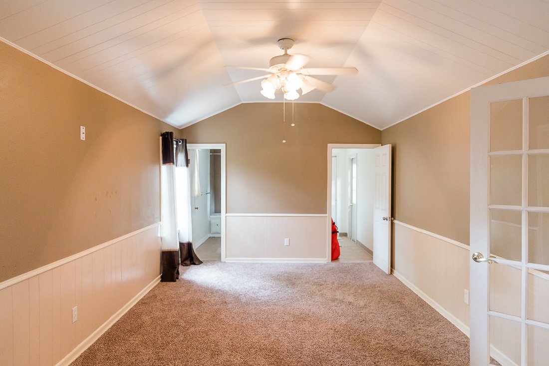
The bathroom is located at the very back of the house and was clearly a DIY add-on. It was essentially a square space that had been divided into two halves- one side being the bathroom and one being the laundry room. You can see the two doors in this old house photo below- the left is the bathroom and the right is the old laundry.

Here’s the left side- our “dorm bathroom” with basically no storage, and the toilet so close to the door I couldn’t even get it in this shot, haha!

And the other side- old laundry room. There was a door to the exterior that we ultimately decided to close in.

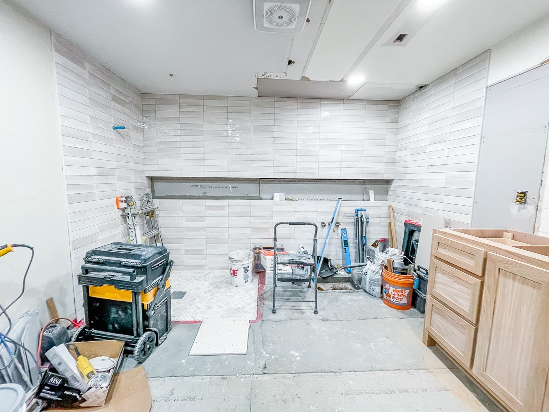
I COULD NOT WAIT to see what it looked like once that middle wall was removed. Here’s what it looked like! You can see the spot where the bathtub once was was in really bad shape, and we also had to contend with the water heater that was basically in the middle of the room.

Here is my sketch of the same wall.

In progress:

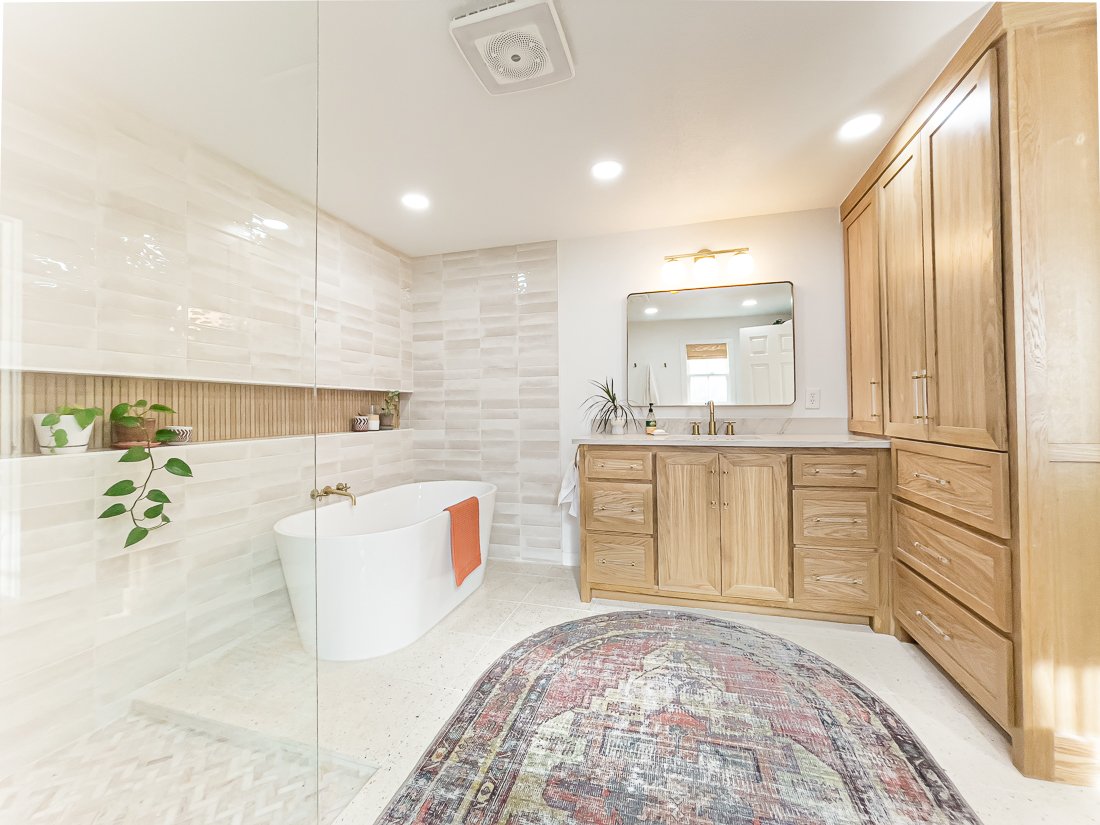
And the final!

East wall before:

My sketch:

And after!

We are so in love with the way everything turned out. The square layout of the room was the biggest challenge for me, because I was set on having this semi-open shower and tub layout.

You can see below I was trying my darndest to squeeze in 2 vanities, but we eventually decided against this in order to create a more spacious feeling in the room. I also didn’t want to compromise any of that countertop (a.k.a. curling iron) space with 3 girls in the family. Thankfully, Shawn didn’t mind and so we share a sink.

I also added in a floor-to-ceiling linen closet which was much-needed. This and the vanity gives us plenty of storage and keeps the rest of the room very open feeling.

My original design also included a curbless shower and a shower niche that extended all the way across the back wall, so that it is useful for both the shower and the tub, and adds interest to the completely tiled back wall. Our contractor eventually convinced me to add a small (it is maybe 1.5”) curb to the shower just to contain the water a bit better, and I am really happy with the way it turned out. This also meant I needed to add a 4th(!) type of tile to the design.

The large shower niche was also a bit of a challenge. Remember the huge water heater that was smack dab in the middle of this back wall? We ended up swapping it out for a tankless water heater that is located in a storage closet adjacent to this room and it was one of our more costly choices, but SO worth it. I love having hot water almost immediately when we turn on the faucet- and in this 76-year-old home that is something I don’t take for granted.

Instead of creating the shower niche inside the existing wall, our contractor essentially built a faux wall on top of the structural wall, and that allowed us to run plumbing for the bathtub and create this long niche. I love the way the horizontal line creates a steady, linear design, and place for my little plants!

Let’s talk about finishes!

I wanted our bathroom to be a very peaceful, spa-like space that would feel clean and cozy. I had tons of great inspo on my Master Bath Pinterest board, but unfortunately most of the finishes there were just way out of our budget. So, my goal was to create the same look on a budget.

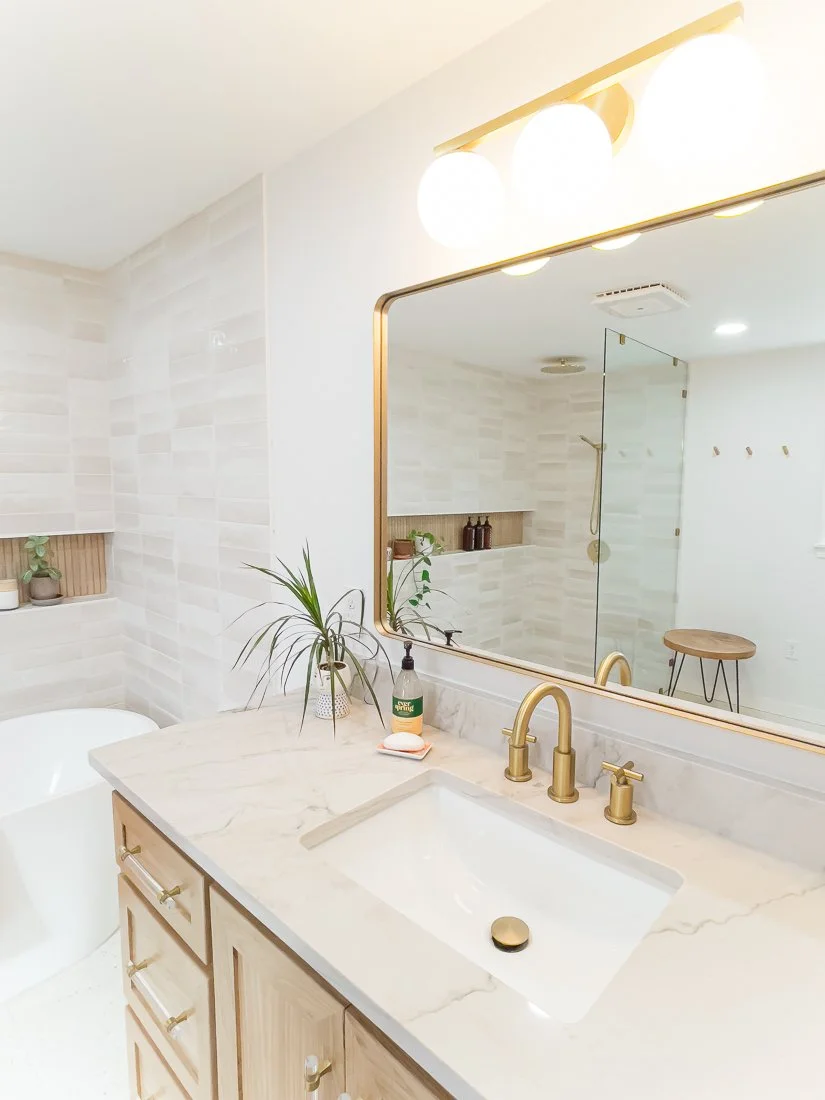
I was crushing over this tile from Bedrosians, but it was just too expensive for us- so I ended up with this similar tile from Home Depot, which had the same warm white and color variation.

My biggest splurge and my favorite thing in our bathroom is the terrazzo tile floor from TileBar. I’m obsessed.

The wood-look tile in the niche is also from TileBar and was backordered for a couple of months, but it was worth the wait. It matches our white oak cabinets perfectly.

I also struggled to find the right size and type of rug that would fit this space, and was so excited when I found this WASHABLE rug! It is thin but absorbent. Because of the placement of our toilet, a rectangular shaped rug was too large- so the oval was a perfect solution.

I did not initially plan on doing natural stained cabinets, but once I realized how light everything else would be in the room, I decided it would ground the space better to keep the cabinets natural. These are white oak with a clear coat finish. I loved the acrylic and gold handles I found, too- I like that they let the wood grain shine with just a touch of the gold that runs throughout our house.

The countertop is quartzite- similar to what we have in our kitchen. I love the soft grey and how it picks up the same tones in the wall tile.

All in all, we are super pleased with the space and it functions beautifully for our family. I love that I have a peaceful little spot and that it can essentially turn into a big steam room when the shower’s running.

I will link everything I can here!

Contractor: Allure Kitchen & Bath (they were so great to work with- we already have them started on another project!)

Wall & Trim Color: Pure White by Sherwin Williams

Floor Tile • Shower Floor TileShower Niche TileShower Wall TileVanity Light

CLICK HERE FOR ALL OTHER FIXTURES + ACCESSORIES

major front porch glow up!

AnglinAbode, DIY, HOME + LIFESTYLElissa-anglin1 Comment
IMG_0286-2.jpg

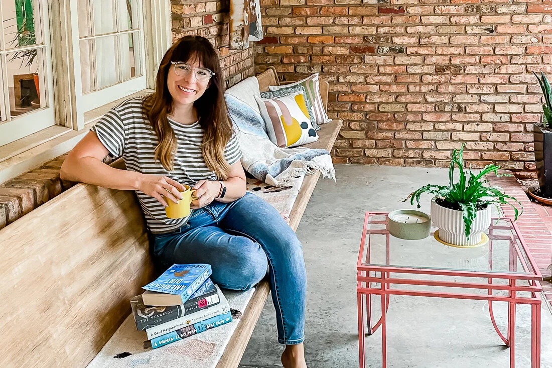
My front porch space has received basically all my love and attention since the weather’s warmed up. It’s essentially my new living room and I have loved sitting here to read, pray, and watch kids play. I’ve been wanting to cozy it up and when I realized that Cricut made pillow covers, I knew I wanted to create some custom pillows for this space.

First, let’s talk about what the patio looked like before:

2021-04-10 16.38.15 HDR.jpg

Pretty blah. The 14’ pew bench came with the house when we bought it (score!), and the metal “A” sign is one we’ve had- Shawn hung it up for me not long ago. But there was a LOT I wanted to do to this space.

First, I tackled the door. It was brown and beat up. We’d already replaced the decorative frosted glass with more modern rain glass, but I wanted to add a pop of color and change out the handle. So that’s what we did! I painted it the same color as our kitchen island- Relentless Olive from Sherwin Williams- and we switched out the gold curved handle for a more modern black one.

My favorite hint for painting any type of wood (or even faux wood)- use deglosser! Saves you hours of sanding and allows the new paint to adhere perfectly!

LissaAnglin_PartofMeBlog_0088.jpg

Once the door was done, I set my sights on the church pew. It was in ok condition- but was cracking in some spots and I suspect someone tried to stain it at some point and didn’t do a great job- it was super uneven. The easiest thing would have been to paint it, but I wanted to keep it a wood tone, so I started sanding.

You can see how the pew really needed some love here. I wanted to lighten it up so it didn’t blend in with the brick as much, so that is the reason I decided to sand!

You can see how the pew really needed some love here. I wanted to lighten it up so it didn’t blend in with the brick as much, so that is the reason I decided to sand!

2021-06-17 07.42.02.jpg

It took me a couple of days to sand all 14 feet of it, but it was worth it. Once sanded, I wiped straight-up cheap bleach on it to lighten the overall color. I ended up doing this about 3 times and it worked beautifully. My Vintage Porch has a great tutorial on this that was very helpful.

Once everything was sanded, I used some wood filler to repair some of the cracks in the wood. This is my favorite kind to use because the color changes letting you know it is dry.

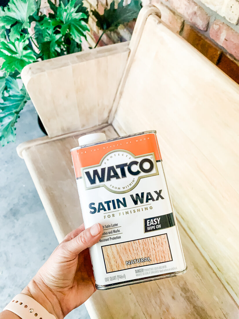
After bleaching, I coated it with Watco Satin Wax to give it a little protection. I wanted to keep the light look but also protect the wood I had just worked so hard to uncover. This did the trick! Once it went on, it did darken the wood a bit, and I panicked, but then it lightened again as it dried.

2021-06-17 09.01.03.jpg

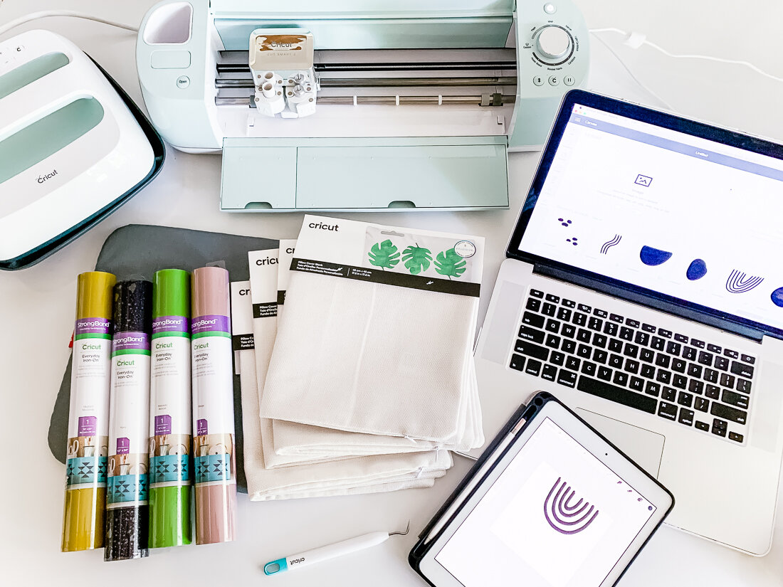
Now for the fun decorative stuff! I made the pillows using my Cricut Explore Air2 and Cricut Easy Press. Their heat press products and tools are so much fun. I ordered basically everything from Cricut and here is a list of the products I used:

Cricut Explore Air 2

Cricut Easy Press + Easy Press Mat

Cricut Everyday Iron-On (I used beige, avocado, black and mustard for these pillows)

Cricut Pillow Covers

Cricut Weeding Tools

I drew all the doodles and shapes on my iPad, then uploaded them to Cricut Design Space. From there, I made 4 different compositions for 4 pillows, and cut them on the 4 different colors. A few of my design elements were too large to be cut on my 12x12 mat, so I had to slice them and cut them in sections, then put them back together when it was time to heat press them.

I’ve uploaded my design file to the Cricut Design Space Here, and you can use it for free!

IMG_0306.jpg

Organic Shapes Collage Pillows

FREE Cricut Design Space filed linked here!

Then, it was collage time!

All my shapes are weeded and it’s time to start collaging them onto the pillow covers using my Easy Press!

All my shapes are weeded and it’s time to start collaging them onto the pillow covers using my Easy Press!

The Easy Press makes it really simple to adhere the Iron-On to the fabric. You just set your temperature and time, push the “C” button, and it times it all for you.

I adhered the bottom layer first and then added additional layers, being sure to keep all Iron-On Material covered with the transfer film (even if it was already adhered) under the Easy Press (or else it would melt!).

I was really pleased with how these turned out and love the quality of the Cricut Pillow Covers. They are perfect for my patio space.

IMG_0303-2.jpg

Lastly, I found a cute little metal coffee table (it was already pink, and I was great with that!) on Facebook Marketplace and pulled out a few pillows and a Mexican blanket I already had.

I had purchased this floor runner for our kitchen and ended up not liking it, but it worked perfectly folded hot-dog style on our bench as a pseudo-cushion! Here’s the final reveal:

IMG_0322.jpg
IMG_0327.jpg
IMG_0302.jpg

I’m so thankful for this space. I never set out to have a matching set of anything- but I do my best to buy and create things that I love- which, it turns out, kind of all go together.

It’s been a collection of little projects that make a big impact on my attitude- I love sitting here and just enjoying every little thing- and I have big intentions for the conversations, wine nights, and prayer times to be had here.

warmer weather home prep

lissa-anglinComment

This post is sponsored by Fox Pest Control, whose franchises are locally-operated by experts in pest control. I received services in exchange for this post, but all reviews and opinions are mine.

Fox-4720-Edit.jpg
Fox-4692-Edit.jpg

What’s the first thing you do for your home when the weather starts warming up? For me, it’s alllll about the plants. Ya’ll know I’m a wannabe plant lady and lovingly nurture my planties all through the winter, in hopes that I’ll be able to put them outside to grow big once it’s finally warm enough.

So that’s one thing that’s always at the top of my list- because it’s the most fun for me, honestly. Shawn’s list generally has something to do with the lawn- weeding, mowing, watering…standing with his hands on his hips just looking at it...you get the picture. 😂

A few years ago Shawn convinced me that we’d really benefit quarterly lawn service that comes to spray for weeds and fertilize throughout the year, and so we went for it. Over time, I was really impressed at how much it helped- and I loved the fact that we didn’t have to call to set it all up- they just let us know when it was time for another treatment. Hello, automation!

So when Fox Pest Control reached out to me about the possibility of doing one of their home protection plans- I was all ears. See, when you live in a house that was built in 1942, you acquire quite a few little friends with it. 🐜Old houses like ours are full of cracks and holes, which is part of what gives them character, but these things also allow in all sorts of creepy crawlies. (Get excited- they gave me a special discount code I’ll share at the end of this post!)

Fox-3834.jpg

With Fox’s home protection plan, we receive quarterly visits that help keep critters and crawlers out of our house. This time of year, when the weather is warming up is when we tend to see most of the action. Sugar ants, spiders, and springtails are some of the most common offenders around here.

I really enjoyed the initial consultation with Fox, because they are family-owned and truly want to take care of you and your home. I spoke with River who went over the basics of the home protection plan with me, and then Jake arrived at our home about a week later.

He took the time to walk the inside and outside of our house with us to discuss any problem areas we were concerned about. Once he started working, he was very conscientious of any pets or decorative plants and avoided them as he sprayed the entire interior and exterior of our home.

It was clear that he was very knowledgeable about the different types of pests we may encounter in our home and was sure to treat each one specifically. He also cleaned off all of the window casings and checked for any cracking or bugs there.

Before he left, he also gave us several disposable boxes that you can easily put together to trap mice, which we will use in our outdoor shed, since we don’t have a garage. I was so impressed at how thorough he was.

Fox-3851.jpg

One of the best parts about the home protection plan is that not only does it include the quarterly visits, but it also includes free target treatments. This means that any time we see a pest, we can call and Fox will come take care of it. I love knowing that a system is already in place and that our home will be pest-free! Anytime I can put a little home maintenance on auto-pilot, I jump at the chance, and this is a perfect example!

I’m thankful to Fox for giving my readers an exclusive discount on their services. Use the code LISSA when you call (806) 375-3989!

a quick d.i.y. sun shade for the backyard

DIY, AnglinAbode, LIFESTYLElissa-anglin20 Comments
IMG_3308.JPG

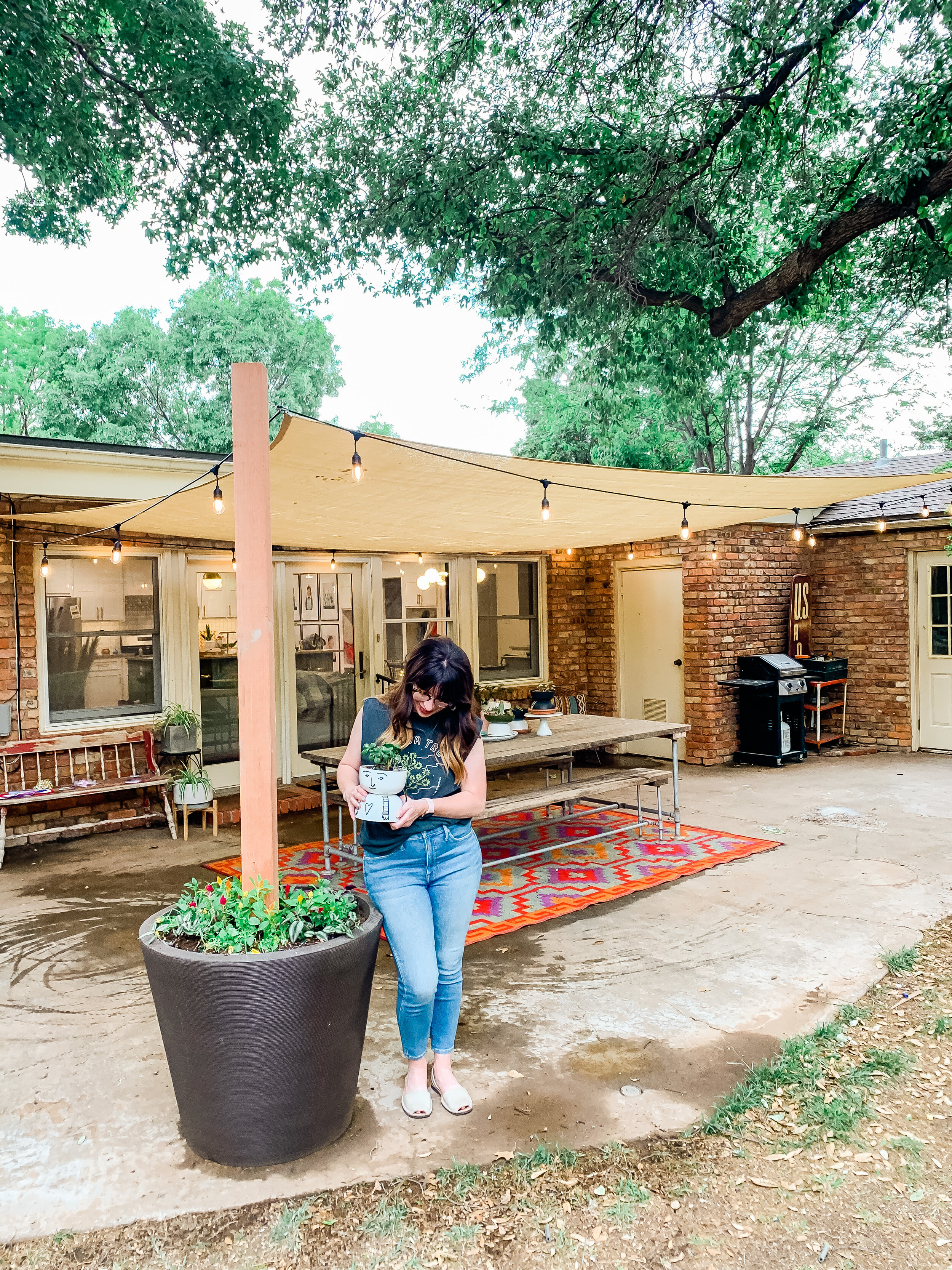
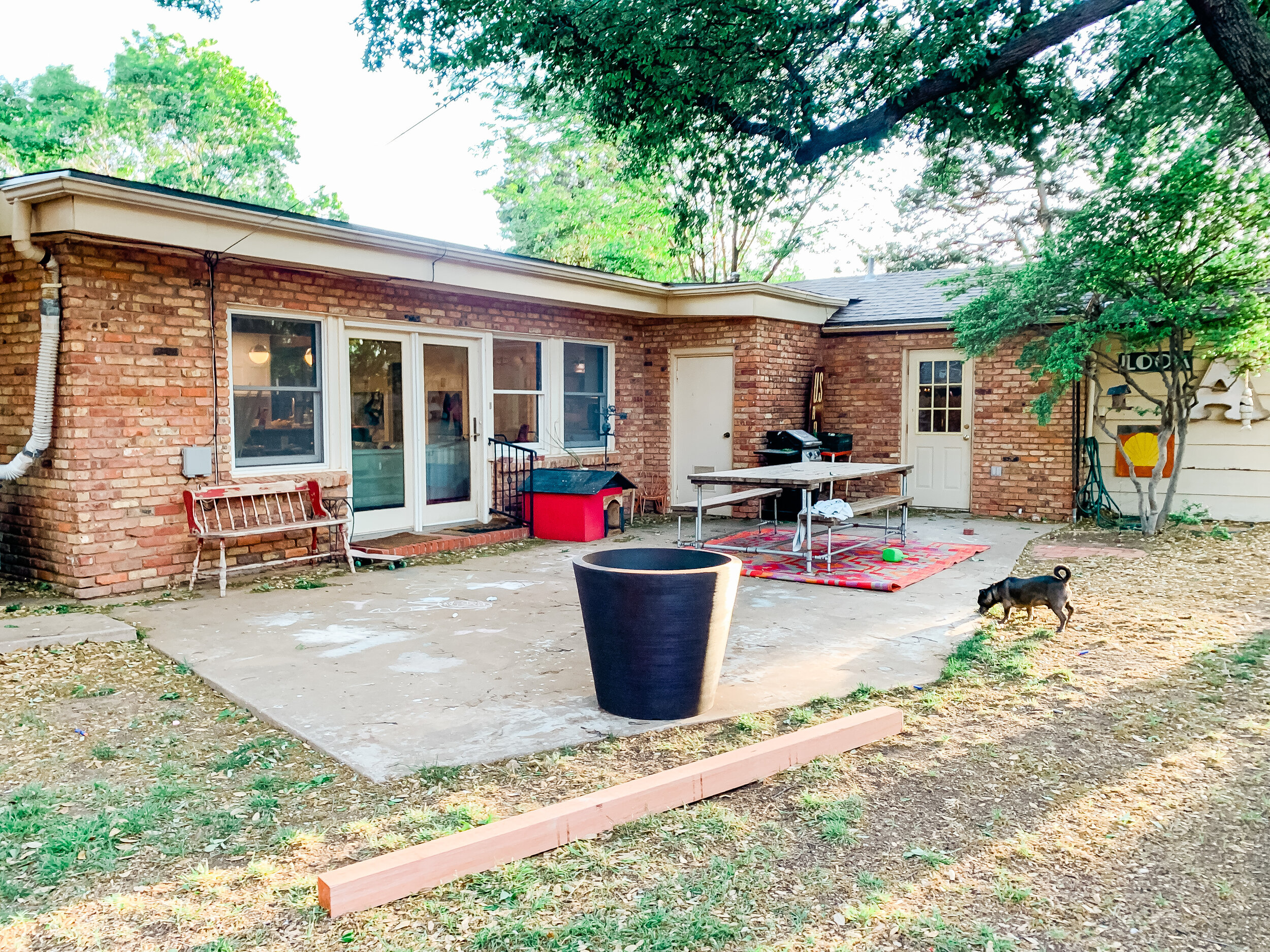
I’m excited to show you this quick and relatively inexpensive project for creating a sun shade patio area. We created our own planter post to act as an anchor point for the sail and it worked beautifully.

We’ve officially been in out new house for a year now and have been excited to work on some outdoor projects now that the weather is warming up. Our backyard patio area has a concrete slab, but that’s pretty much it. We’ve known we wanted to get a pergola eventually, and have even gotten a few quotes for one, but with the cost of lumber sky-high and other renovations taking priority, we opted for a much less expensive quick fix.


IMG_3052.JPG

Materials Needed:

  • Shade Sail- we bought ours on Amazon and got a 14x20 size. There are a ton of sizes and colors available. Tip: be sure you remember that there will need to be some space between the shade sail and your anchor points to properly create tension and keep the shade taut. Otherwise, it will be drapey.

  • Outdoor String Lights- these are the ones we got and we love them! They are plastic bulbs but look like glass.

  • Large (and I mean LARGE) planter- we bought ours at At Home and it is probably 2’ tall and 1.5’ at the base.

  • Quickcrete Concrete- we bought 4 bags

  • 4x4 8’ Cedar Post

  • 4 1/4” Eye Hooks for anchoring the sail to the house/tree/post (hardware store)

  • Coated cable up to 1/8” and cable fasteners- we needed these on a couple of sides where the anchor point was farther away (hardware store)

  • Carabiners to easily connect/take down sail at anchor points (hardware store)

  • Tension hooks to adjust tension on sail- you need at least 2- these we bought on Amazon

After we gathered all our materials, we got started on the planter post. First we centered the 4x4 in the middle of the pot, and while I held it sturdy, Shawn mixed the concrete around it. It didn’t take long at all for the concrete to set. We let it dry overnight.

IMG_3059.JPG

After the concrete was dry, we tested the post with a lot of pushing and tilting to be sure we didn’t need to add another layer of concrete. We ended up throwing in some extra bricks we had just to add some weight and drainage for the flowers I would be planting in the pot.

Then, it was time to start hanging the sun shade. This involved a lot of troubleshooting thought about where the exact anchor points needed to be. We ended up drilling 2 eye hooks into the brick of the home, one into the planter post, and one into a large tree probably 15 feet away from the patio area that was at a better angle than the original tree we’d envisioned using. Shawn set an anchor point about 15’ up in the tree so that the cable actually goes over the roof of our home and won’t interfere with anything.

We used carabiners to attach the sail so that in the case of very strong wind we could quickly take the sail down- and we plan to take it down in the winter as well.

partofmeblog.com.png

Once everything was attached, we used the 2 tension hooks to tighten the shade.

Then, it was time to hang the lights. I’d initially thought I would put them in an x shape underneath the sail, but they hung too low for my liking, so I ended up hanging them in a box shape. Since they are made for outdoor, I wasn’t too worried about weather on them.

It was finally time to pot some plants in the planter. I drilled 6 drainage holes about 1/2 way down the pot and then filled the pot with potting soil and added plants. I am glad we added the bricks because they will soak up excess water as well, while also allowing for drainage.

And that was it! We are loving our new shade sail and I can’t wait to work on some seating/decor for the rest of the patio area!

I wish I’d done a better job taking photos of the process, but it went so quickly I forgot! Here is a semi-put-together recap of my Instagram stories about it for all you visual learners like me!

It's a Family Day in the LBK!

LIFESTYLE, TRAVELlissa-anglinComment

This blog post is sponsored by Visit Lubbock, an organization I was honored and excited to work with because of all the great things they do for our community. They work hard to be at the forefront of all things new and exciting in Lubbock and are my first go-to for news and events!

You know we love a good adventure- even if we don’t have to go far to find it! And thankfully- we don’t! When Visit Lubbock contacted me about doing a Family Day in Lubbock for National Travel and Tourism Week, I couldn’t say “yes!” fast enough.

Shawn and I grew up in a small West Texas town about 3 hours from Lubbock, and truly never expected to stay after moving here just after we were married. But, we have! And I believe we’ve stayed for many reasons:

IMG_2505.jpg
  1. The People. Truly, Lubbock is one of the friendliest places on earth. We have found wonderful friends and a church community here like none other, and we are so thankful for them.

  2. The Culture. We love living in a city that has a large university (fun sports games to go to and other events, beautiful campus to walk through, camps and programs for the kids), and a thriving arts community. Being an artist myself, the arts scene here constantly inspires me.

  3. The Food. We have a LOT of GREAT places to eat- driving through town, it doesn’t take long to see that! There is always something new to try and discover, plus tried-and-true faves.

  4. The Size. Lubbock isn’t the biggest city in Texas, and we like it that way. “Across town” is a 20 minute drive. It’s not too big, and not too small. Coming from a smaller town, I thought I’d really made it big when I moved to a city with a Starbucks!

So, last Saturday we set off on a Family Fun Day in Lubbock- and it was so much fun, we are definitely going to be doing it again soon!

VisitLubbock-3566.jpg

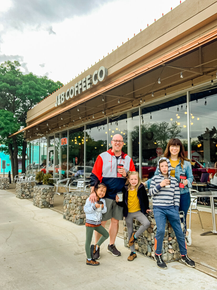
1st Stop: J&B Coffee

We are a little partial to this coffee shop because it is the one housed comfortably in our neighborhood- but if we ever were to move, we’d sure miss it! It’s a cozy study spot for many TTU students, but there are also a lot of regulars here.

Things you must try if you’ve never been:

  • Red Raider Royale (so rich and delicious!)

  • Lavender Cold Brew (seasonal)

  • Vietnamese Iced Coffee

  • Any of their locally-roasted coffees- our personal faves are Costa Rica La Minita and Governor’s Cup

IMG_2479.jpg

Other great local coffee shops:

Sugar Brown’s

Pearl Tea

Monomyth Coffee

Yellow House Coffee

Tova Coffeehouse

Tumbleweed and Sage

He-Brews

IMG_2521.jpg

2nd Stop: Texas Tech University’s Public Art Collection

Texas Tech has a beautiful campus sprinkled with amazing art and sculpture- and this is no accident. Through the Public Art Program, public artworks are funded using one percent of the estimated total cost of each new major capital project. I love this program and what it has done for campus and for art lovers like us!

The program has put together several free walking tracks where you can view the amazing sculptures and other art- many of which are interactive. Our kids LOVED this “scavenger hunt” and it was the perfect way to expel some extra energy they had due to the hot chocolates at J&B.

We had never done a walking track before and we are excited to invite friends to do it again- there is so much to see and did I mention it is completely free?

IMG_2530.jpg
VisitLubbock-3602.jpg
IMG_2546.jpg

Other cool things to check out:

American Wind Power Center

Silent Wings Museum

Buddy Holly Statue and West Texas Walk of Fame

Buddy Holly Museum

IMG_2559.jpg

Next Stop: Lunch @ Tom and Bingo’s

Tom and Bingo’s is a local favorite and exactly what you want in a BBQ joint. It’s got limited seating, delicious brisket, and a line out the door. We were lucky to get there while there were seats available and they hadn’t run out of food! (Yes, they run out everyday- it’s that good!)

My parent's joined us for lunch and despite our large group the employees at Tom and Bingo’s were so kind and helpful. We love their brisket sandwiches and Bingo burgers. Worth a stop and worth the wait if there is a line.

VisitLubbock-3613.jpg
IMG_2575.jpg

Other local lunch faves:

Dirk’s

Caprock Cafe

The Crafthouse Gastropub

Capital Pizza

Choochai

Burklee Hill Vineyards

Blue Sky

Next Stop: The National Ranching Heritage Center

If you’ve never been to the NRHC, they have something for everyone- and the perfect time to go is a beautiful West Texas day like we had! Here, there is a ton of history and they’ve gathered ranch buildings, old homes and artifacts of life on the Plains and displayed them in a city-like configuration where you can walk through them and see just how they were used.

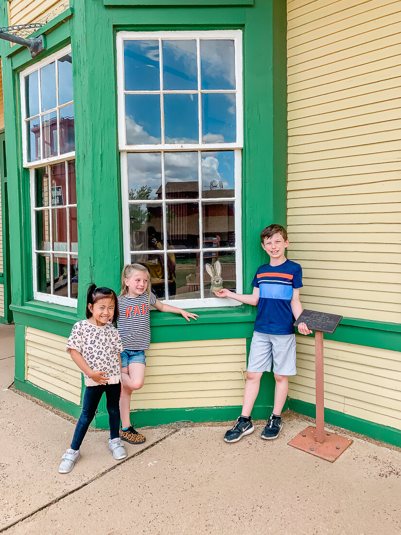
Our kids loved looking for Jackrabbit Joe throughout the property and finally found him at the train depot. The NRHC hosts a variety of events throughout the year- like the Candlelight at the Ranch during the holidays- and it is a truly magical experience.

IMG_2624.jpg
IMG_2592.jpg
IMG_2583.jpg

Other fun activities for kids in Lubbock:

Play Street Museum

YWCA Sun ‘N Fun

Prairie Dog Town

Joyland

Altitude Trampoline Park

Science Spectrum Museum

Lubbock Lake Landmark

Stars & Stripes Drive In Movie Theater

4ore Golf

Miss Megan’s Make Room

Texas Tech Sporting Events (check out their kids club!)

Frisbee Golf at Mae Simmons Park

Buffalo Springs Lake

South Plains Fair

Caprock Canyons State Park

IMG_5259.jpg


Next Stop: The LHUCA and CASP Studios

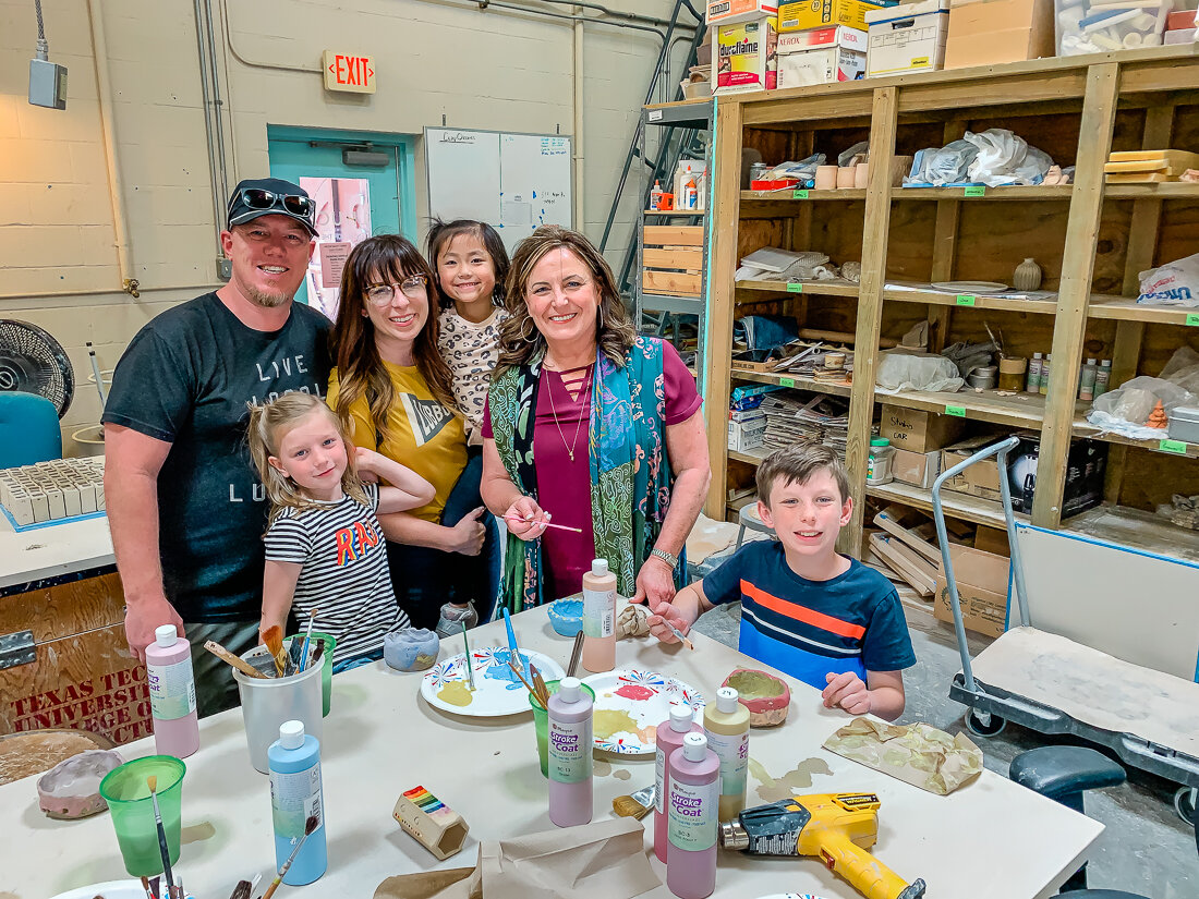
The arts district in Lubbock is special to us and there are so many cool things to do and see there! It is full of fun, colorful murals and sculpture- worth a visit if even to just walk around. At the LHUCA, we were able to see some amazing artwork and then had the opportunity to make clay pinch pots at the clay studio! Instructor Mica was so kind and great with the kids- we had a blast!

The LHUCA hosts the First Friday Art Trail every month and is one of our favorite things to do in the “Hub City”. They also have many art classes - for kids and adults! They’re hosting youth summer camps, too- check it out here.

IMG_2641.jpg

Other cool downtown spots to check out:

Two Docs Brewery

LBK Brewery

Buddy Holly Hall

CASP

Jux Ta Posh

The Garden


Last Stop: Dinner at Triple J Chophouse

Always a fave with us- Triple J! This restaurant has been a staple in our Lubbock life- locally brewed beer, live music, and delicious eats with a fun atmosphere. We love pretty much the entire menu, but have a few things we always order:

Raider Red Ale (brewed by Triple J)

Chilton (the local cocktail created first in Lubbock)

House salad with house dressing (lemon vinaigrette- SO good!)

Wedge salad (equally delicious!)

Any of their steaks- we love the Miss Kitty Kat and Sir Nick

Pizzas (kids always get this)

Chicken “Potted” Pie

And of course their house-made rolls and butter- you WILL leave full, I promise!

IMG_5273.jpg

Other great dinner spots with kids:

The Plaza

Cook’s Garage

Teddy Jack’s

Picosos

And because mom and dad need a date night every now and then:

La Diosa

Stellas & Manhattan 9

Italian Garden

The West Table

Table 82

Cook’s Garage

La Diosa

The Funky Door

Burklee Hill Vineyards

The Nicolette

IMG_2542.jpg

Lastly, I wanted to include some of our local favorites in other categories:

Snacks and Treats:

The Pie Bar

Holly Hop Ice Cream Shop

The Soda Shack

Kurbside

Shopping:

Jux Ta Posh

Odds and Ends

Barque

The Heritage Press

J Hoffman

Vibeage

Wineries:

English Newsom

McPherson Cellars

Burklee Hill

Llano Estacado Winery

Pheasant Ridge

Bolen Vineyards

Thank you to Visit Lubbock for giving us the gift of family memory making in our city! I hope this blog post has been helpful and will try to update my lists as I think of new places or places I have missed. AND- if you’d like to add to my lists, feel free to comment your local faves!

thrifted word banners made with cricut!

CRAFTS, DIY, HOMElissa-anglinComment
IMG_1354.JPG

Ya’ll, never have I had such a rollercoaster of a project. When I first pitched to Cricut that I wanted to make some cool signs for my home with thrifted pieces, I couldn’t WAIT to get started. So of course, I waited riiiight up until the last day to make them and GUESS WHAT?!? The project failed miserably.

So I tried it a little differently. FAIL. And then I tried like 3 more times before I just threw up my hands and yelled ABANDON SHIP! 😂Thankfully, I have one of the best thrift shops in town close by and so I hopped in the car and sought out some new inspiration. And like always, the thrift store delivered.

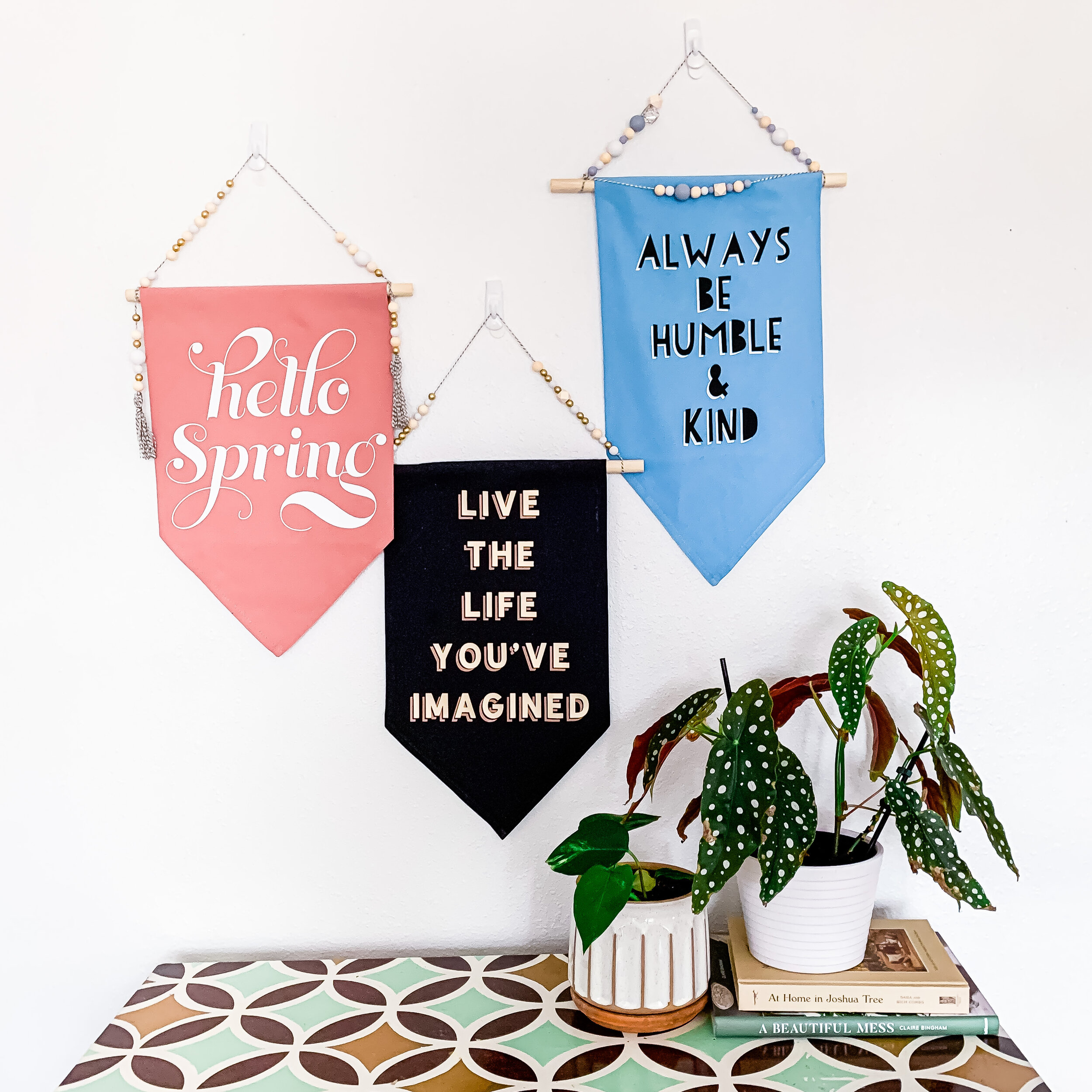
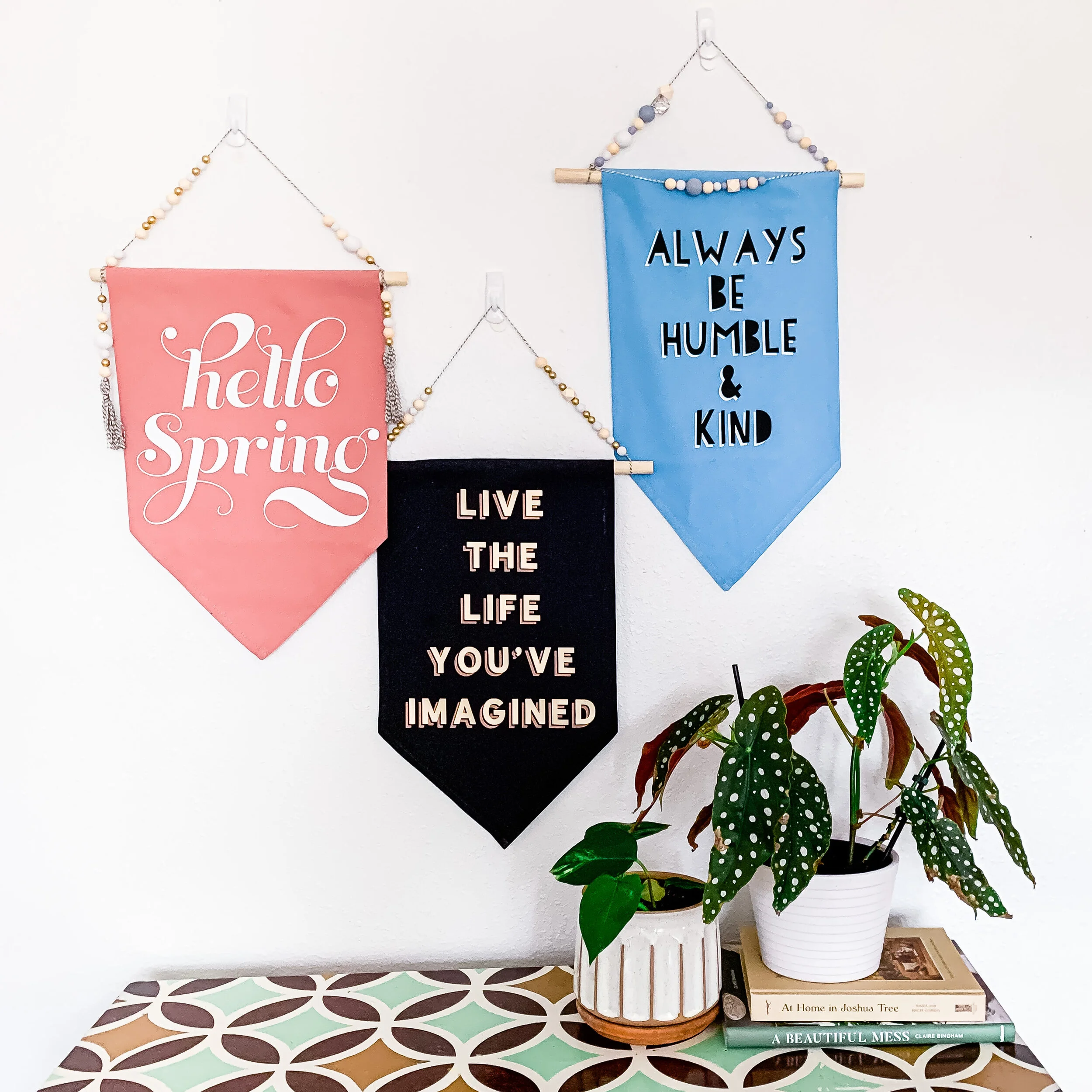
I ended up picking up some old linen napkins (you know, like your grandmother puts out at Christmas and Easter?) and making something I’m really quite proud of- these super cute NO SEW word banners.

I made these using my Cricut Air 2, Cricut iron-on, and Cricut Easy Press. If you’re a newbie to using Cricut iron-on, this would be a super fun project to start with.

The vintage linen napkins I snagged cost me a total of $3 at the thrift store. Mine were 19” square cloth napkins, but almost any scrap fabric would work for this- think tablecloths, placemats, etc. I think a pattern would make some really neat banners as well!

IMG_1343.JPG

Supplies Needed:

  • Cricut Machine- I used my Air 2, but depending on the size of your banner a Cricut Joy would work!

  • Cricut Light Grip mat

  • Cricut Easy Press

  • Cricut Easy Press Pad

  • Cricut Iron-on- I used white for “Hello Spring”, Beige for the shadow and Gold Shimmer for the main on “Life the Life”, and Black for the shadow and white for the main on “Always Be Humble & Kind”

  • Cricut Weeding tool

  • Old Linen Napkins or other fabric

  • Hot Glue Gun

  • Scissors

  • 5/8” Dowel Rod (or whatever suits the size of your banner)

  • Fabric De-fuzzer (obviously this is optional- but the napkins I bought needed it, and the iron-on wouldn’t have adhered well without a de-fuzz)

Check out this video for the full tutorial!

You can access my design files for FREE in the Cricut design space!

Always Be Humble & Kind Banner File

For this design, I used white Cricut Iron-On for the shadow and black for the main text. Click on the image to be taken to the file in design space!

IMG_1365.jpg

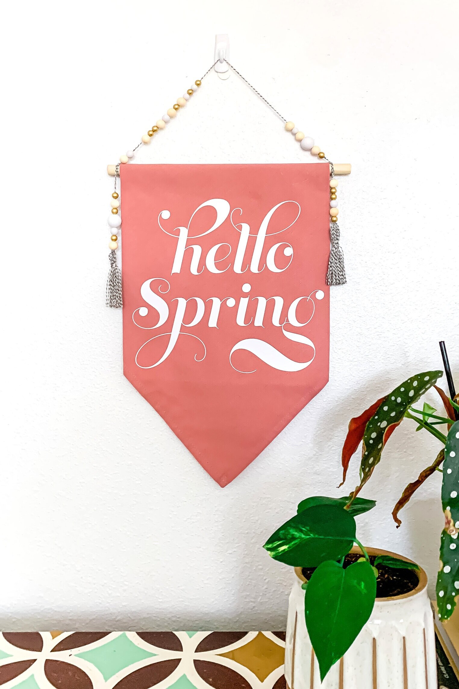
Hello Spring Banner

For this design, I used white Cricut Iron-On for the text. Click on the image to be taken to the file in design space!

Live The Life You’ve Imagined Banner

For this design, I used beige Cricut Iron-On for the shadow, and shimmer gold for the main letters. Click on the image to be taken to the file in design space!

I would LOVE to see your banners if you give this project a try- please tag me @lissaanglin! It was a relatively quick one, and so much fun to add the beads and twine. You could really go crazy with the extra decor- I’m thinking tassels, felt balls, buttons, flowers…you name it!

IMG_1346.JPG
CricutWordBanners4.png


More Posts Like This:

#anglinabode Kitchen Reveal

AnglinAbode, HOME, HOME + LIFESTYLElissa-anglinComment
AnglinAbodeKitchen-1323.jpg

I am SO excited to show you this before + after. This kitchen remodel was the top priority for us in this home- and the first project we tackled. I’d better show you what we were working with when we bought this home first.

The kitchen is behind this beige wall- you can see the fridge and top of the faucet from here. Unfortunately, the kitchen had already been renovated in recent years- but was just not my taste at all, and though there was an attempt to open up the space, it still felt very dark and closed in.

320822ndSt-8855.jpg
320822ndSt-8861.jpg

You can see here how the kitchen opened up into the back living space- but again, it just felt really dark and I felt it had the potential to function a lot better for our family with some reconfiguration. In the photo below, the far corner that has an air vent is where the coffee bar is now. Check out this post to see all the details on the coffee bar!

320822ndSt-8869.jpg

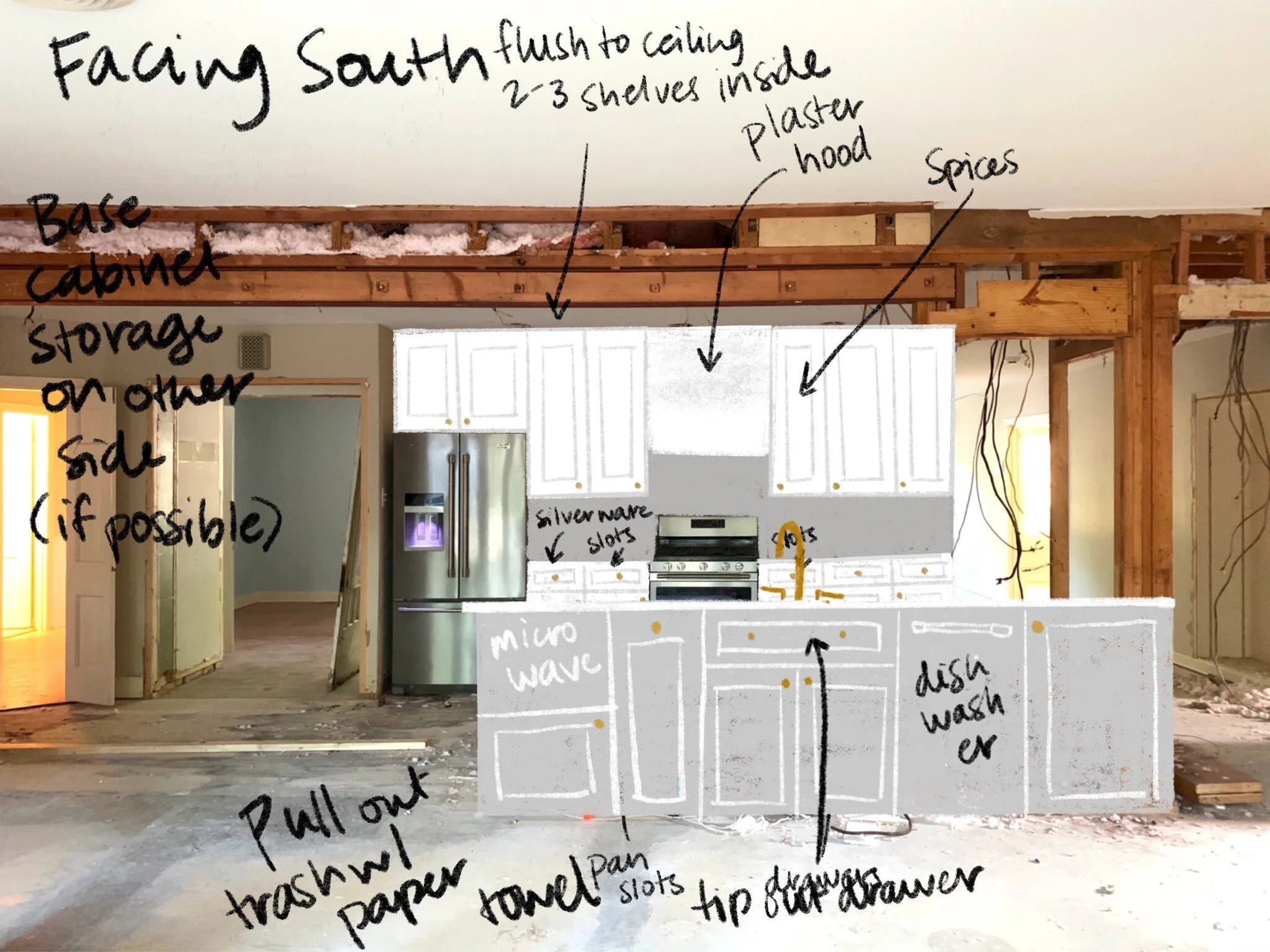
Here’s my sketch of the kitchen after demo. You can see that the beams had yet to be installed and the pantry (to the left) has been opened to make it larger- more on the pantry here!

In this sketch the kitchen island is flipped the wrong way so you can see the side that actually faces the oven. I hadn’t decided if I wanted to do a color on the island yet, or leave it white. Also, you can see I switched from knobs to pulls.

Untitled_Artwork 3.jpg

And now for the reveal!

I really love how it turned out. For this project, we had to put in two beams, since the parts of the kitchen I wanted to open up were structural. I was worried that it wouldn’t be able to happen, and it would have been such a disappointment had we not been able to open it up completely- BUT our contractors got it done!

Opening up the kitchen to the hallway and the back living space made it a much more functional space for our whole family and we spend most of our time in this area.

AnglinAbodeKitchen-1081.jpg

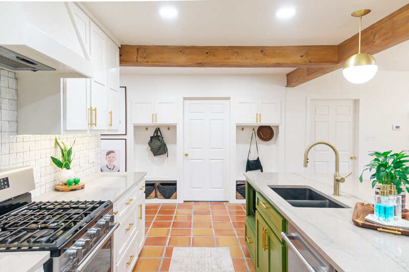
I love, love, love my green island. Once I knew we’d be doing saltillo tile throughout this space, I wanted to counter all those orangey-reds with something complimentary but still natural feeling. This color is Relentless Olive from Sherwin Williams, and I have never identified with a paint color name more in my life. :)

AnglinAbodeKitchen-1115.jpg

The white color throughout our home is Pure White from Sherwin Williams. I have been so thankful that I chose to paint trim, walls, ceilings, and baseboards all the same color- it has made the painting process so much easier for me and everything is cohesive.

AnglinAbodeKitchen-1139.jpg

Here is a before photo of the main hallway- to the left is where the laundry room door and cubbies are now, and to the right is the kitchen and island. You can see we lost a lot of great built-ins, but the functionality and flow we gained was worth it.

320822ndSt-8845.jpg

Here is my design sketch for the cubbies- I eventually decided to leave the bottom section open so I could fit whatever baskets I wanted. This doorway was also previously just a wall between shelving- we created a doorway here and moved the laundry room to this area.

Untitled_Artwork.jpg

I love that these cubbies have storage as well as hooks for backpacks, jackets, etc. Their location in the house is really nice too, because they are an easy spot to unload as you come inside- our front door is just opposite the shelf with greenery in the photo below.

AnglinAbodeKitchen-1167.jpg

A few notes on design choices here:

  • This home immediately gave me a spanish/mission feel and I felt like I could make that work seeing that we are in West Texas- and so I wanted to keep the textures and tones warm and cozy without it feeling too cramped.

  • My mid-century loving heart also needed some gold hardware and white walls- plus some Atomic Ranch vibes. So, the globe-shaped pendants and sconces over the island and coffee bar- plus the chandelier over the coffee bar that includes globes really satisfied that for me.

  • I really debated on the backsplash tile- and initially thought I would just go with white subway- but when I went to sample it, the white tones were just completely off- our paint choice being a warmer white made the subway tile look cold and hospital-like, so I kept looking. Finally- I found some interesting geometric tile on clearance at Lowe’s- and it was perfect. I would have never guessed I would go with it, but for us it has been subtle with some uniqueness- and because it is dimensional I have enjoyed the way the light plays off of it throughout the day. Unfortunately, because it was on clearance, we almost didn’t have enough to finish the job! We ran out of tile 3/4 of the way through and finally located a few more boxes in the Dallas area, where my sister picked them up and saved the day!

CoffeeBar-6026.jpg
AnglinAbodeKitchen-1351.jpg
  • One of the huge perks of this home (and one of the things that convinced Shawn it was s good buy) was that all the appliances were basically brand new- like still had the warranty stickers on them new. So, we didn’t have to spend anything on appliances, with the exception of the fridge drawers and ice machine in the coffee bar. This was a huge savings for us.

  • I chose a black sink in the main island and the coffee bar and I have loved that choice. Not only does it hide stains well, it is super durable and I love the contrast. I’ll link everything below!

  • Our countertop is Macaubus Quartzite- and is probably my favorite thing in our kitchen. I knew I wanted something that had a lot of veining and movement, but marble made me nervous and quartz didn’t have the natural feel I was looking for. So, when we visited the stone yard, our friend who owns the place educated us on the different types of stones and found this slab for us. It is overall a light grey with some subtle green, blue, orange and purple tones. The green of the island really picks up the veining, which I think looks like a heartbeat line in some places. I absolutely love it.

AnglinAbodeKitchen-1231.jpg
AnglinAbodeKitchen-1267.jpg
AnglinAbodeKitchen-1158.jpg

I hope you enjoyed my tour! I’ll list links to everything I can link below!

White Paint Color: Pure White by Sherwin Williams. Our trim, cabinets and walls are all this color and it has made painting the whole house (my primary job in this reno) SO much easier!

Tile: Saltillo (terracotta) tile from Yates

Countertop: Macaubaus Quartzite purchased from Stone King in Lubbock

Contractor: Re-Purpose Construction

Everything else linked below!

perking up my coffee bar with my cricut!

CRAFTS, DIYlissa-anglinComment

This post is sponsored by the awesome people at Cricut, who give me the freedom to create the projects I want to do, and the ability to do them well with all their amazing products.


CoffeeBar-6000.jpg

See what I did with that title?! You guys know I love a good pun.

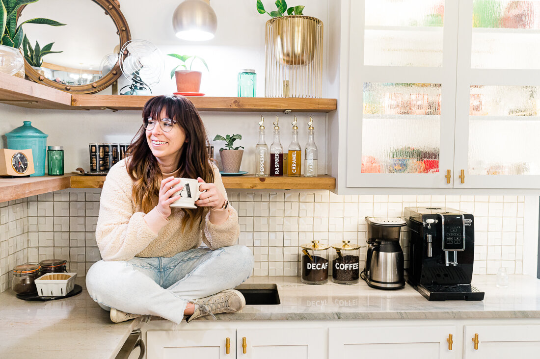
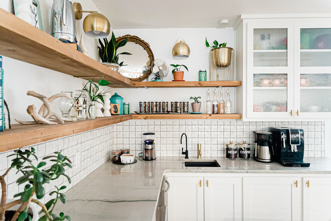
I’ve finally finished decorating the new coffee bar area in our home- for now, anyway. :) And I couldn’t resist creating some customized coffee canisters and flavoring syrup bottles for it! To see some crazy before + afters, check out my previous post for the before + afters of this part of our #anglinabode reno.

CoffeeBar-5935-Edit.jpg

I wanted it to be an area I loved to look at and spend time in, but also highly functional as well. We do a LOT of coffee here, but we also have an ice machine and like to make fun sodas. The syrup flavorings we use for these are delicious, but I didn’t love them cluttering the countertop.

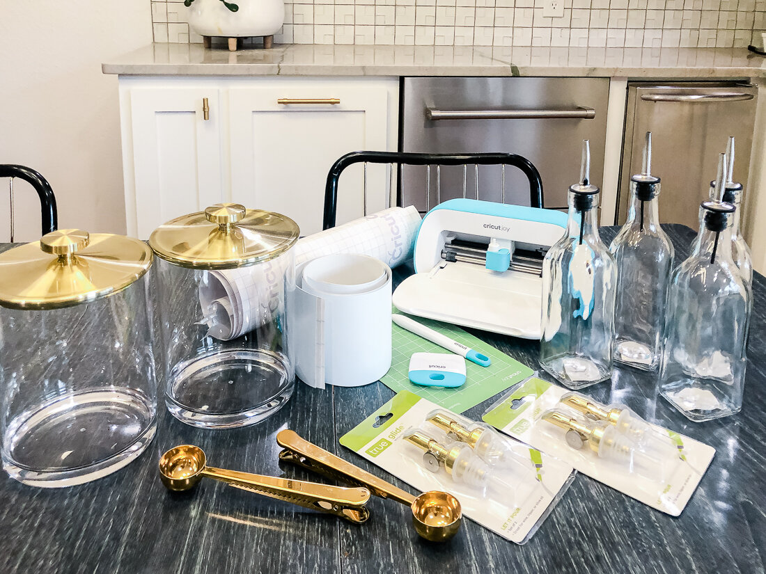
So, I was so excited when I found these inexpensive olive oil bottles at WalMart. To up the ante, I also ordered these super cool weighted spouts in a gold color.

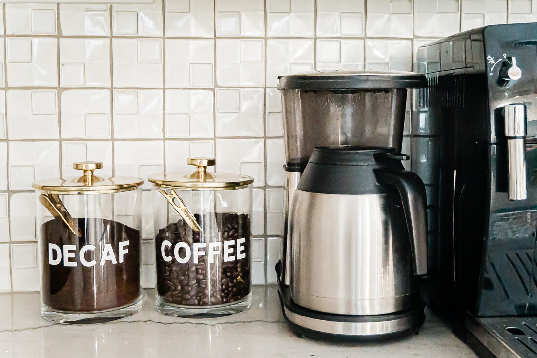
I also wanted to pull in some gold accents to match our knobs and fixtures, so I was pumped to find these gold and clear canisters (which come in a bunch of different colors too!). They look like glass and metal, but are plastic- which is honestly much better for this clumsy crew. I also added these really cool coffee scoops to put inside the canister that also function as a bag clip.

This is a pretty simple cut and stick project, so I’ll just fill you in on all the details!

Here’s what I used for this project:

IMG_4871.jpg

Cricut Joy

Cricut Transfer Tape

Cricut Permanent Vinyl

Scraper and Weeder Tools

Cricut Joy mat (optional)

Gold Canisters

Coffee Scoops

Olive Oil Bottles

Gold Weighted Spouts

I used the font Hanley that I purchased from Creative Market. This is one of my most-used fonts and has been a great purchase for me!

I was sure to keep my font size the same throughout all of the labels. This keeps the overall look consistent and professional. Be sure to double check your measurements and make sure the longest word will still fit in the space given the font size. I alllllmost didn’t get the word “peppermint” to fit!

Here’s a quick video of the process:

Pinterest1.png

I really love the way they turned out! I’d love to see your coffee bar projects, too- be sure to tag me @lissaanglin on any social media!

This post contains affiliate links, on which I will receive a small commission should you purchase anything/sign up/subscribe etc. I would never share something I didn’t actually like or want to share with you, so I wanted to let you know. Sharing affiliate links affords me a few more lattes and it’s always my aim to add value to your life with the brands and products I share. Thanks for supporting me!

#anglinabode coffee bar before + after

HOME, HOME + LIFESTYLE, DIYlissa-anglin1 Comment
CoffeeBar-5814-Edit.jpg

So excited to finally share one of my favorite spots in our new home- the coffee bar! This space used to be a blank, open corner- and I knew immediately upon walking in the house that there needed to be something there to draw you in. Here’s the before:

320822ndSt-8871.jpg

Soooo much blah. There were several issues here we had to deal with:

  • The weirdo uplights that are along the walls above the doors and windows. We removed those ASAP.

  • The french doors (open in the above image) that led to the master bedroom. I have nothing against french doors, but I did not want them leading to my bedroom off the main living space- especially when my son has friends over (yikes!)- so we closed in this opening a bit and made it a regular door.

  • The thermostat had to be moved.

  • The AC vent was an issue- because I wanted to do lower cabinets there. I am pretty proud of our solution!

  • Sooooo much electrical work had to happen. Light switches and outlets needed to be moved, and I added sconces, under cabinet lights, pot lights and a chandelier. Because this room was originally a porch, there is NO attic space so installing all of this was a real task I’m thankful our contractors were up for.
320822ndSt-8845.jpg

The original view from the main hallway. Unfortunately, all of these shelves are now gone, but it’s for the better, I promise! You can see how this corner is visible at the end of the hall.

Here is my Coffee Bar Inspo:

Coffee Bar by Lissa Anglin

Here is the area mid-construction. This home has been renovated at least 2 times before this one- you could see all the layers and modifications once the walls were peeled back. Poor old house- I hope we will do her justice and make this the last renovation.

IMG_4651.JPG

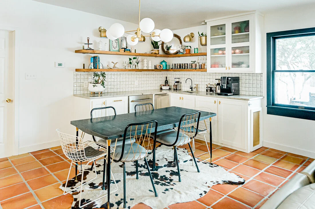
Annnnnnnd here’s how it turned out!

CoffeeBar-5981.jpg
CoffeeBar-5989.jpg
CoffeeBar-6052.jpg

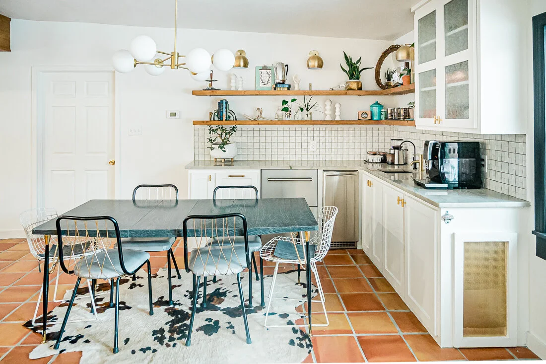
I’d originally thought about doing green cabinetry (Relentless Olive by Sherwin Williams, which is on our kitchen island), but chose to keep it white (Pure White by Sherwin Williams) so that this potentially dark corner stayed as light and bright as possible.
It was important to me to have a large decorative element (the open shelving) to draw you into the space from the front door. This corner is the perfect landing space for everyone, and it perfectly accommodates a solo cup of coffee or a bunch of rowdy kids!

One day, I’d love to find a tulip table to put in place of my vintage black one here, but for now this table is serving us well!

I mentioned the issue of re-routing the AC vent earlier, and the solution was to create a vent on the side of the bottom cabinets (see that gold box? It’s actually a vent!). We also created a new vent (also housed inside the lower cabinets) into our bedroom on the other side of this wall to keep the air flowing. Amazingly, we still have quite a bit of storage in those cabinets.

When I shared this corner on Instagram, many people thought this was actually my kitchen space- and it sort of is! It is open to the kitchen, so it feels like an extension of the kitchen, really.
This little corner packs quite a bit in to keep it super functional for our family. I didn’t want to have to walk all the way across the room just to throw away old coffee grinds or to fill up the pot. It includes:

  • pull out trash can

  • double drawer fridge

  • nugget ice maker

  • RO system

  • small sink

CoffeeBar-6058.jpg

This little area of our home is where I splurged the most. Having the extra drink space and “Sonic ice” has really made working from home enjoyable- and I also love the fact that everything is accessible for the kids.

CoffeeBar-6010.jpg

Another thing I was very intentional about was the black quartz sink. Knowing that there would be a LOT of coffee in this sink, I wanted to avoid having to bleach it often, and the black sink has been so wonderful for that!

Here’s a “lights on” image- we put the sconces, chandelier and pot lights on all different switches and have really enjoyed the ability to adjust the lighting to the time of day/mood. The bulbs inside the sconces are actually grow lights and I keep them on all day so that my planties get the sun they need.

CoffeeBar-5669-Edit.jpg

For the glass in the upper cabinet, I chose rain glass. I’m not into the frosted look, but I also wanted a little diffusion on it. I really love the way it turned out!

I’m going to do my best to link everything pictured here:

White Paint Color: Pure White by Sherwin Williams. Our trim, cabinets and walls are all this color and it has made painting the whole house (my primary job in this reno) SO much easier!

Tile: Saltillo (terracotta) tile from Yates

Countertop: Macaubaus Quartzite purchased from Stone King in Lubbock

Contractor: Re-Purpose Construction

Chandelier (I really wanted this one from West Elm, but it was just plain out of budget. In the end, I’m really happy with the one we have and think it is a more appropriate size for the space anyway).

Sconces (these were surprisingly affordable!)

Knobs

Sink

Faucet

Drawer Fridge

Ice Maker

Grow light bulbs (for keeping my plants alive! I put these in the sconces)

Backsplash tile was a clearance find and we almost didn’t have enough to finish the job because it was disappearing from stores so quickly! Thankful my sister picked some up for us in the DFW area so we wouldn’t have a half- finished wall.

Just in case any of you are coffee fanatics like us, here are our coffee makers:

Coffee Pot

Espresso Machine

Coffee Grinder

So, let me know what you think! We are loving our coffee corner and I have so much more to share with you soon!

This post contains affiliate links, on which I will receive a small commission should you purchase anything/sign up/subscribe etc. I would never share something I didn’t actually like or want to share with you, so I wanted to let you know. Sharing affiliate links affords me a few more lattes and it’s always my aim to add value to your life with the brands and products I share. Thanks for supporting me!

Our Trip To Monahans Sandhills State Park

TRAVEL, MOMLIFE, LIFESTYLElissa-anglin1 Comment
Monahans-0093.jpg

Mid-December of this year, I began anticipating the stir-crazy that inevitably happens in our household when our kids are out of school for more than a week. I don’t like it, they don’t like it, and I’ve learned that if I don’t have any options, the ship can sink rather quickly.

So I started searching for some easy (and COVID/social distancing friendly) day-trip options for our city- Lubbock, TX- and friends, let me tell you- there weren’t a lot of options that we hadn’t already done- save one.

We’d never visited the sandhills outside of Monahans.

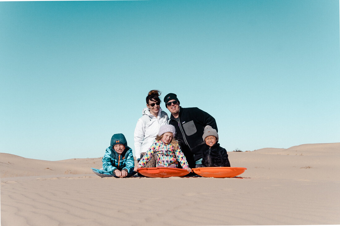
So I ordered some sleds and put it on the calendar. It’s about a 3 hour road trip for us which isn’t great, but Shawn and I did enjoy a quiet ride home while the kids were asleep after a long day.

Monahans-0103.jpg

Visiting Monahans Sandhills State Park 

For those of you who’ve never heard of this truly unique place, it is a state park located between Monahans and Odessa, Texas, which is almost the middle of nowhere. The park almost seems to pop up out of the earth with an ethereal almost moon-like feel- just huge expanses of sand dunes all around. It is beautiful and unusual- and the perfect place to take some sleds and do some Texas-style sledding!

The sand is deceptive- see those people on the hill? They were at least a half mile away!

The sand is deceptive- see those people on the hill? They were at least a half mile away!

It was early January when we visited and the weather stayed at a warm-ish 50 degrees. The wind did pick up in late afternoon- which was very unpleasant- especially if you’re facing the wrong way with your mouth open...ask me how I know, haha. I am glad, though, we visited in winter as I would suspect that summertime is brutal in the heat. 

We had a great time and it was a day trip we will likely repeat. Here are my tips if you’re planning a trip:

Monahans-0077.jpg
  • There is an entrance fee to the park, but at the time we went the office was closed and there was a link to pay online listed at the entrance. The fee is $4 per person, and the park is open until 10 pm. 

  • You can camp at the park if that’s your thing- I’d love to be there for sunrise/sunset to photograph the area- I am sure it is beautiful. More info on camping here.

  • There were restrooms, but at the time we visited, they were locked. If you have littles, I would definitely bring a port a potty in the car- here is the one we have had for years and has saved us many times!

  • Go in the fall, winter, or early spring- otherwise you will seriously risk getting sunburned and dehydrated. It’s a literal desert, y’all.

  • There are many parking spaces and picnic tables with grills in easy walking distance to the dunes. There was even a volleyball net set up ready for play. 


Overall, we found it easy to get around. We found many great hills to sled down and you don’t actually go super fast unless you go down a man-made path. It’s very comparable to sledding in the snow. 

Even our 4 year old was going down the steepest hill and the sand is so soft it really cushions the fall if you do take a tumble.

Monahans-0109.jpg

That being said, it can be tough to climb back up a hill and would not be a great excursion for anyone who has difficulty walking or climbing. It’s very much like walking in powdery snow.


What to bring:

  1. Sunscreen (yes, even in the winter the reflection of the sun on the sand is BRIGHT- our fave here)

  2. Cooler with water and snacks (we left this in our car and just hiked back for a snack time)

  3. Sunglasses

  4. Case or zipper pocket for phones/cameras (the sand will easily get into these items, and you’ll want to make sure they stay protected)

  5. Shoes: depending on what time of year you go, you may not even need them. The sand is very soft but there are weeds/rocks (they’re easy to avoid). Most of our crew wore tennis shoes which will need to be washed, and Shawn chose boots which were heavier and harder to walk in but more sand-proof. So shoes are really personal preference. 

  6. Beach bag (with waterproof lining so you can spray sand off later)

  7. Change of clothes- I brought a change of clothes for all the kids and we put all the sandy clothing in a beach bag so that my car wasn’t filled with sand. This worked really well- there are restrooms you could change in, but we just did it in the car 

  8. Sleds- I didn’t see anywhere you could rent these, so we brought our own. Here are the ones we have and they worked well!

Optional:

  1. Folding lawn chairs- we saw a few families using these near the picnic tables and thought it was super smart.
  2. Sand toys- our girls love playing in the sand when we go to the beach and probably would have enjoyed playing with some sand toys there, too- however, none of the sand is wet so it wouldn’t stick together, but hey- worth a shot if it means a few more minutes of entertainment for the kiddos!

  3. Volleyball- like I said, they had a volleyball court set up, which is fun!

  4. Frisbee

  5. Backup battery Phone charger- service for us wasn’t great, and our phone batteries dies quickly that day. I wish I had brought my backup charger.

  6. Lightweight backpack or Camelbak- this would be especially helpful if you are going during the warmer months. Mine is much older than this one, but I have had it since college and my Camelbak Cloudwalker is frequently used by both Shawn and me (camping, hiking, Disney, soccer/baseball games), and it’s held up so well. Definitely worth the investment!

I hope this has been helpful! In a year where travel was limited, I was thankful to find some neat places not too far away to create memories with our kids. They have talked about this day trip a lot since and keep wanting to go back to sled in the sand!

Monahans-0074.jpg